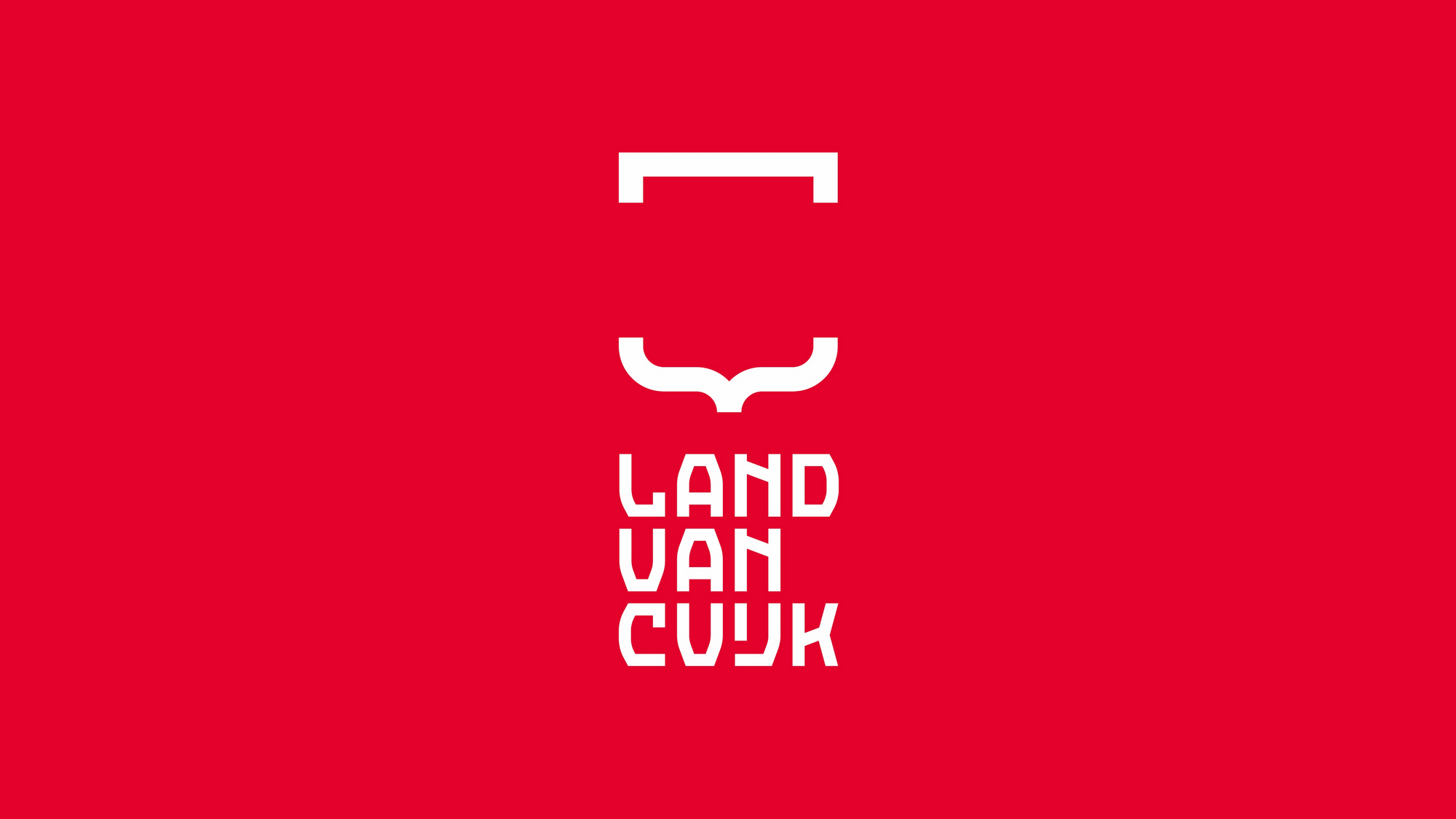
The logo showcases the unique characteristics of the municipality and the core values of the municipal organization.
On January 1, 2022: the municipalities of Cuijk, Boxmeer, Grave, Mill and Sint Hubert and Sint Anthonis will merge as one municipality of Land van Cuijk.
The logo represents the merging of five municipalities through the use of curly brackets and square brackets. The curly bracket is a classic punctuation mark used to indicate what belongs together. In the Dutch language, the curly bracket is known as “Accolade”. The word ‘accolade’ originated from the Latin language that refers to a ceremonial embrace that once marked the conferring of knighthood. When the curly bracket is placed horizontally, it resembles the Gothic arch shape above an entrance gate. The curly bracket refers to the past and rich history. On the other hand, the square bracket is a modern form of the bracket and refers to the future and innovation. The logo forms a modern and open coat of arms that refers to the rich history and at the same time portraits a modern and open municipality that is future and innovation-driven. The wordmark “land van cuijk” is a custom-made font, based on a medieval manuscript with a reference to the rich (monastery) history of the Land van Cuijk. The open logo symbolizes the economic and tourist opportunities in the Land van Cuijk, clear connections with surrounding cities and (foreign) areas and Brabant’s hospitality.
The word “gemeente” has been intentionally omitted so the wordmark “Land van Cuijk” and figurative mark can be used more widely: not only as an identity of the municipality but also of residents and businesses in the Land van Cuijk area. The new municipality is the only one in the Netherlands whose name starts with ‘Land van’. This further differentiates the identity and reinforces the sense of pride and connection that the logo creates. With its large surface area, diversity of people and varied landscape, the new municipality is comparable to a “country”.
The colour red refers to North Brabant and the coat of arms of Jan van Cuijk. The red also stands for “love”.
- Province: Noord-Brabant
- Designer: Di-Visie (www.di-visie.nl)
- Year of Design: 2021
Logo Land is a compilation of all the municipality logos of the Netherlands. In this book, you will find the origin and meaning of the logo itself and of the shapes, forms and colours that have been carefully designed in each municipality logo. Logo Land has featured in the leading newspapers and media channels such de Volkskrant, Reformatorisch Dagblad, Omroep Zeeland, RTV Drenthe, VNG Magazine, FRITS, Binnenland Bestuur, Nationale Ziekenomroep radio and RaRaRadio. The book ranked in the top 20 in the Boekhandel Van Piere top-selling book in CW 43.

0 Comments