
The municipality of Urk has introduced a renewed logo and visual identity, marking a significant update after more than 25 years. The new logo and identity reflect Urk’s characteristics while supporting today’s communication needs. It is a Typographical logo that is inspired by the historical coat of arms. The updated identity brings together tradition, cultural memory and timeless design. It reflects a municipality that is proud of its roots, yet ready to present itself with clarity in a fast-changing world.
A logo with history and meaning
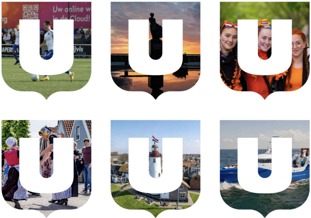
At the centre of the refreshed identity stands the new U-mark, a clear, straightforward symbol designed to capture what Urk represents today.
The U carries multiple meanings tied to the municipality’s identity:
Colours
The primary colors of Dark Blue (CMYK 100 / 80 / 0 / 0)and Blue (CMYK 92 / 46 / 0 / 0) of the municipality of Urk have been carefully derived from both the historical coat of arms and the water. These two elements are deeply rooted to Urk’s identity. The use of these primary colors reflects the strong connection of the community with the sea, which still plays an essential role in the daily lives of its residents. The deep blue of the water and the rich, robust tones of the coat of arms convey a sense of tradition and determination.
At the same time, new visual identity introduces a broader and more vibrant colour palette. The hues are inspired by the Urker kraplap, the colourful decorated fabric traditionally worn on the chest in Urk. With their bright tones, these colors carry the history of the island and create a subtle connection to the culture and craftsmanship of Urk.
Together, the primary and secondary colors form a harmonious whole, where the softer yet powerful secondary colors reinforce the base colors. The result is a balanced color palette that reflects the rich history, culture, and ongoing connection with the water, while also offering a modern and timeless appearance.
The secondary colours support the primary palette by adding subtle variation while maintaining visual consistency. They may be used in a limited way for backgrounds and icons, always in combination with the dark primary blue in the logo, to enrich communication without reducing the prominence of the primary colours.
Typography
The Museo Sans typeface was selected for Urk’s visual identity. Its clean and modern design ensures clear readability across all applications, from official documents to digital communication. This choice supports consistency within the visual identity and helps maintain strong recognisability. This clean, modern font reflects Urk’s dynamic character while respecting tradition and looking toward the future.
The new logo and identity in action

With its new logo, colour palette and supporting elements, Urk presents itself with clarity and confidence. The design is simple and easy to use while still showing what makes Urk unique. The refreshed identity reflects a municipality rooted in tradition, proud of its history and ready for the future.
- Province: Flevoland
- Design Agency: Spikker
- Date of Introduction: 6 January 2025
About the Book
Logo Land is a compilation of all the municipality logos of the Netherlands. In this book, you will find the origin and meaning of the logo itself and of the shapes, forms and colours that have been carefully designed in each municipality logo. A pioneering effort, the first-ever book in Dutch history to archive and explain all municipality logos in the Netherlands.
0 Comments