
After more than 25 years, the municipality of Nunspeet has introduced a new logo and visual identity. The new logo and identity are a clear shift towards a more contemporary and accessible visual language, closely connected to nature, wellbeing, and the local community.
Nunspeet is a green and scenic municipality in the province of Gelderland, located on the edge of the Veluwe, one of the Netherlands’ largest natural areas. It is known for its forests, heathlands, and its location along Lake Veluwe. The surrounding landscape of fens, streams, and ditches offers extensive opportunities for hiking, cycling, and outdoor recreation. The new identity is designed to be recognisable, inclusive, and clearly rooted to the surroundings of the municipality.
A Symbol Rooted in Nature and Connection
At the heart of Nunspeet’s new visual identity is a leaf-shaped logo. The leaf symbolises renewal, health, and wellbeing. Within the leaf, a tree form is visible, connecting four distinct elemtns. These elements represent the four cores of the municipality: Elspeet, Hulshorst, Nunspeet, and Vierhouten.
The tree stands for a stable, vibrant, and resilient community, in which the different villages are connected and support one another. This visual metaphor reflects both the natural landscape of the municipality and its social structure.
Colour
Green is the primary colour within the new identity and represents nature, growth, and development. It reflects Nunspeet’s strong connection to its natural environment. In addition to green, purple accents have been introduced. Purple refers to the surrounding heathlands and adds a second layer of meaning to the identity. The colour also symbolises connection, creativity, inclusivity, and cohesion.
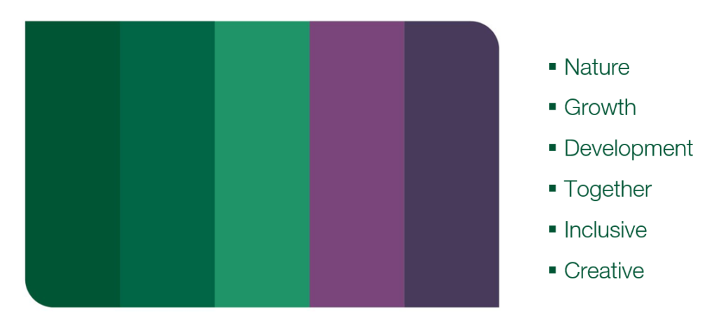
The secondary colours include Forest Green, representing nature; Bright and Light Blue, inspired by the water of Veluwe Lake; Sand Yellow, reflecting the sand drifts; and Spring Green, symbolising the meadows.
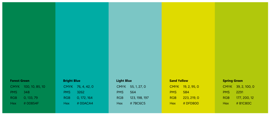
Together, the colour palette expresses that Nunspeet is shaped by both its landscape and inhabitants.
Typography
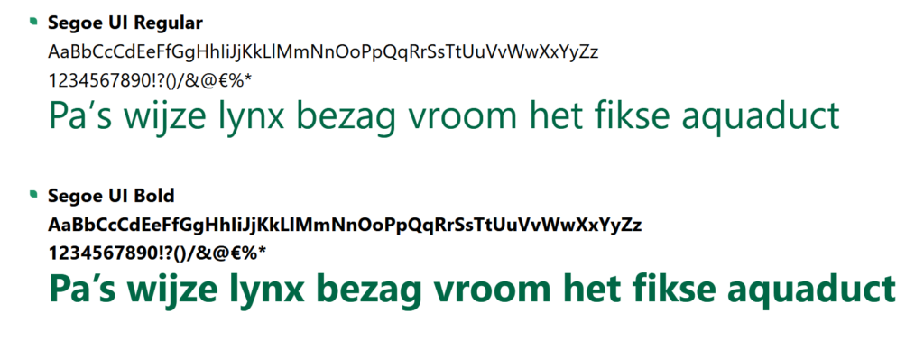
The typeface used is Segoe UI. This font type is a clear, sans-serif typeface with an open and approachable appearance. It is designed for high legibility in digital environments, with open shapes, generous counters and clear differentiation between characters. Its neutral and calm visual tone supports a professional and accessible communication style and aligns well with objectives focused on clarity, inclusivity and ease of use.
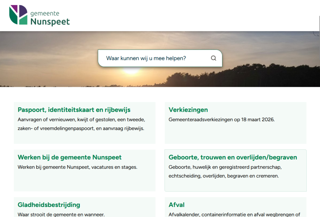
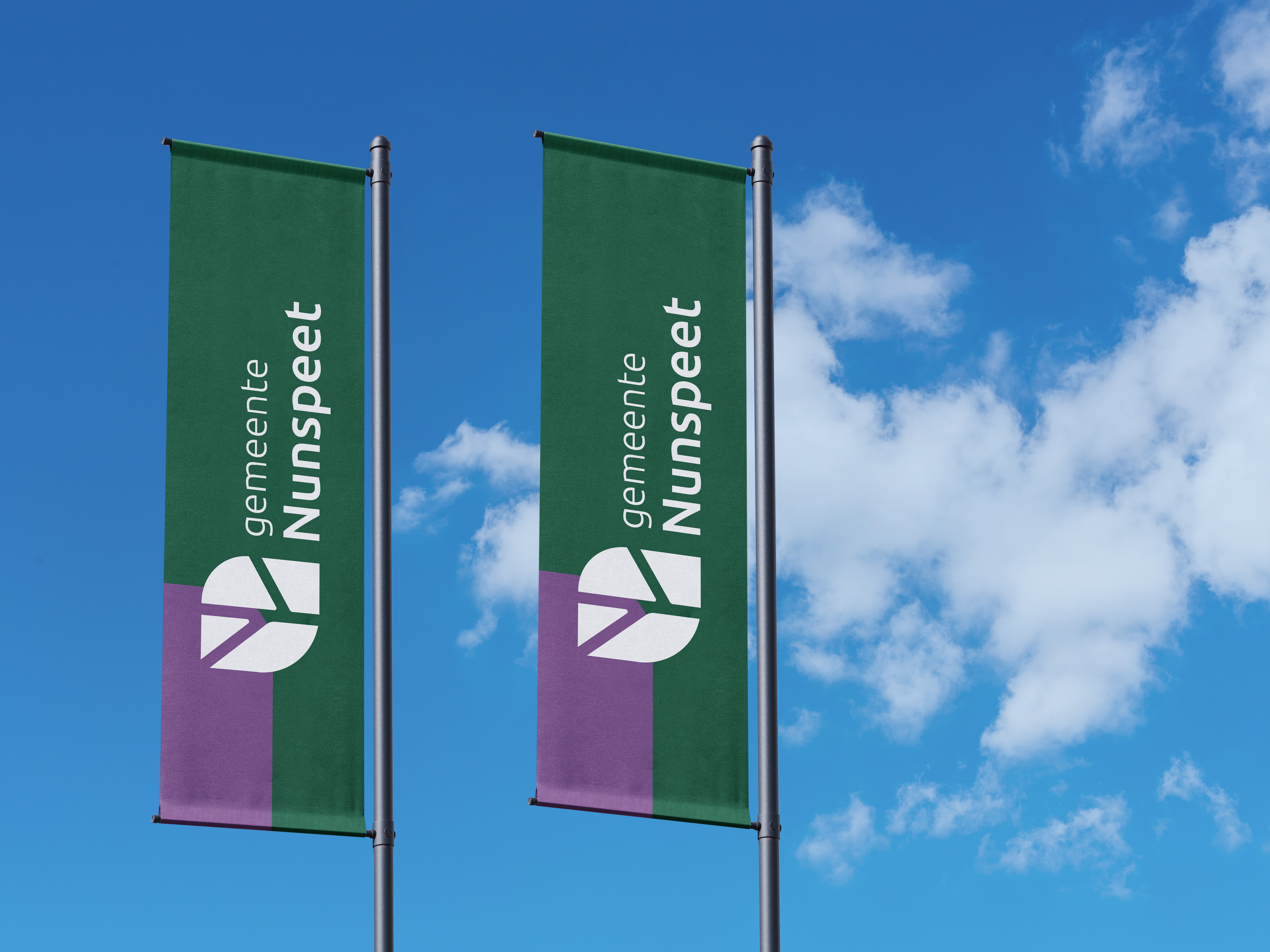
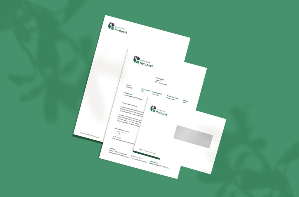
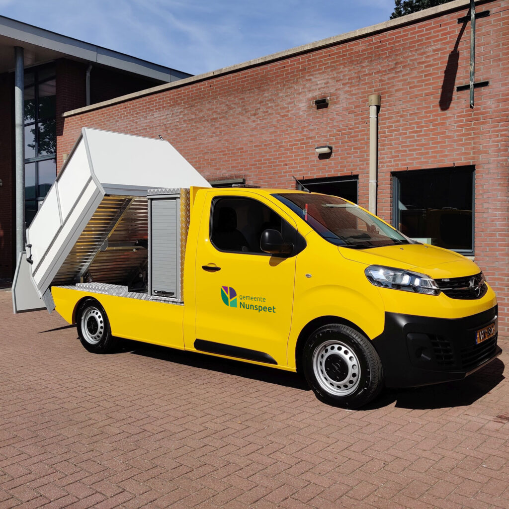
The new logo and identity in action
Nunspeet’s New Identity at a Glance
- Province: Gelderland
- Design Agency: Contique
- Date of Introduction: 6th June 2025
With the introduction of its new logo and visual identity, Nunspeet presents a clear, consistent and timeless framework for the years ahead.
Logo Land is a compilation of all the municipality logos of the Netherlands. In this book, you will find the origin and meaning of the logo itself and of the shapes, forms and colours that have been carefully designed in each municipality logo. A pioneering effort, the first-ever book in Dutch history to archive and explain all municipality logos in the Netherlands.
0 Comments