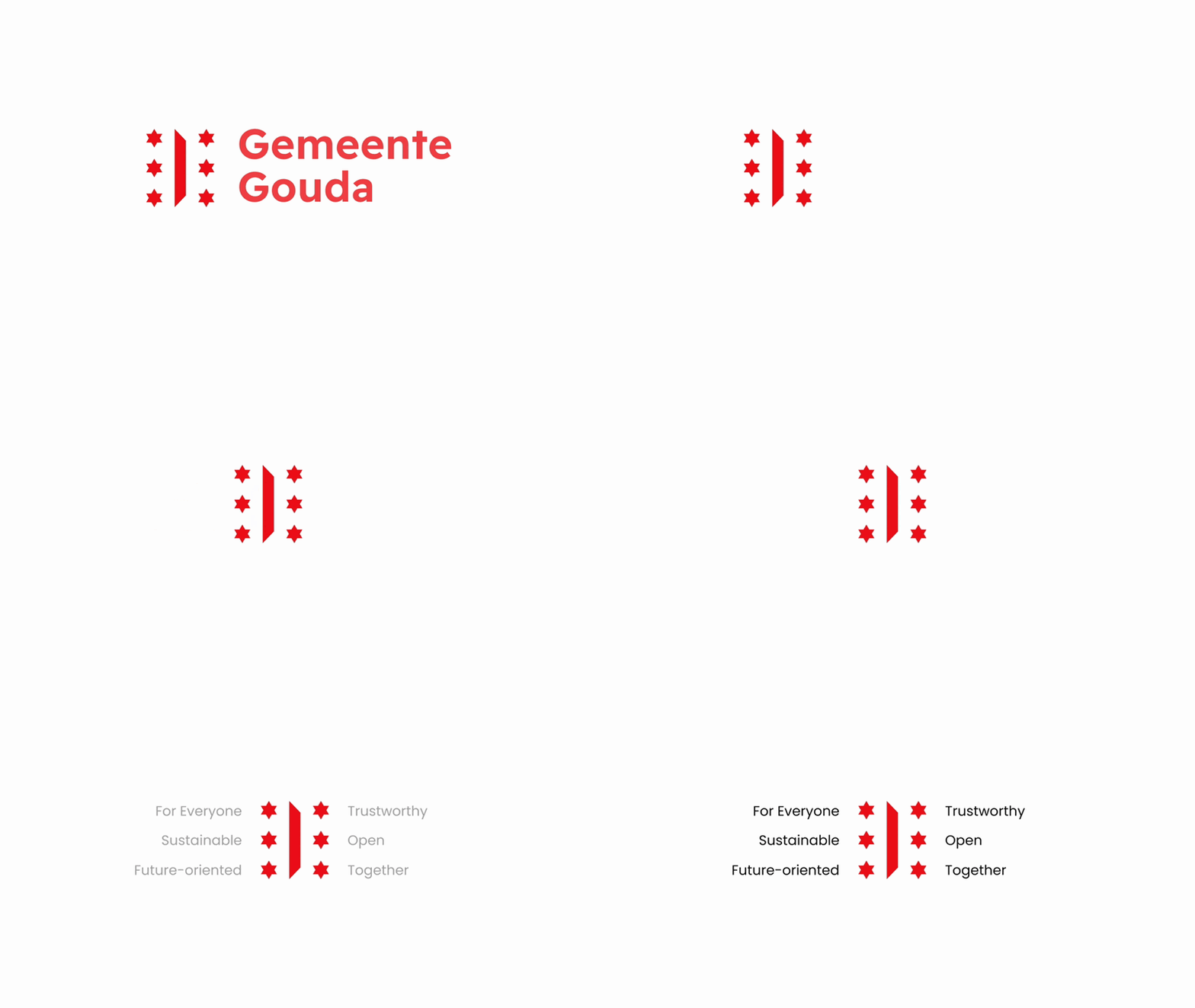
After 36 years, the municipality of Gouda has unveiled a new logo (2) and identity, marking a significant update since 1987. The new logo (2) is inspired by the coat of arms and showcases the core values of the municipal organization.


Due to its historical value and high recognizability, the new logo (2) features six stars from the city coat of arms in combination with part of a hatch shape. Each of the stars symbolises a key value: Trustworthy, Open, Together, For Everyone, Sustainable, and Future-oriented. These stars serve as a representation of the municipality’s guiding principles.

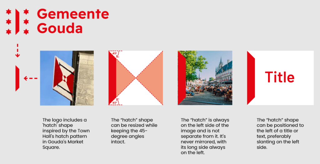
The hatch in between the stars is inspired by the Town Hall’s hatch pattern in Gouda’s Market Square. The hatch shape is also used as a separate element for developing assets such as pictures, posters, magazines etc. Next to this logo is the name Municipality of Gouda is written with an open-source font: Readex Pro Bold.

The Primary colour of the logo, red is derived from the coat of arms. The colour red stands for courage and sacrifice.
- Province: Zuid-Holland
- Design Agency: 3MegaWatt
- Introduction Date: 16th January 2023
Logo Land is a compilation of all the municipality logos of the Netherlands. In this book, you will find the origin and meaning of the logo itself and of the shapes, forms and colours that have been carefully designed in each municipality logo. A pioneering effort, the first-ever book in Dutch history to archive and explain all municipality logos in the Netherlands.
For more info, visit this link: amitbiswas.nl/logo-land


0 Comments