On January 1, 2023, the former municipalities of Brielle, Hellevoetsluis, and Westvoorne joined hands to form a new municipality called Voorne aan Zee. The merger marks not only a coming together of communities but also the birth of a brand new identity. Voorne aan Zee is situated on the island of Voorne-Putten in the western Netherlands, in the province of South Holland.
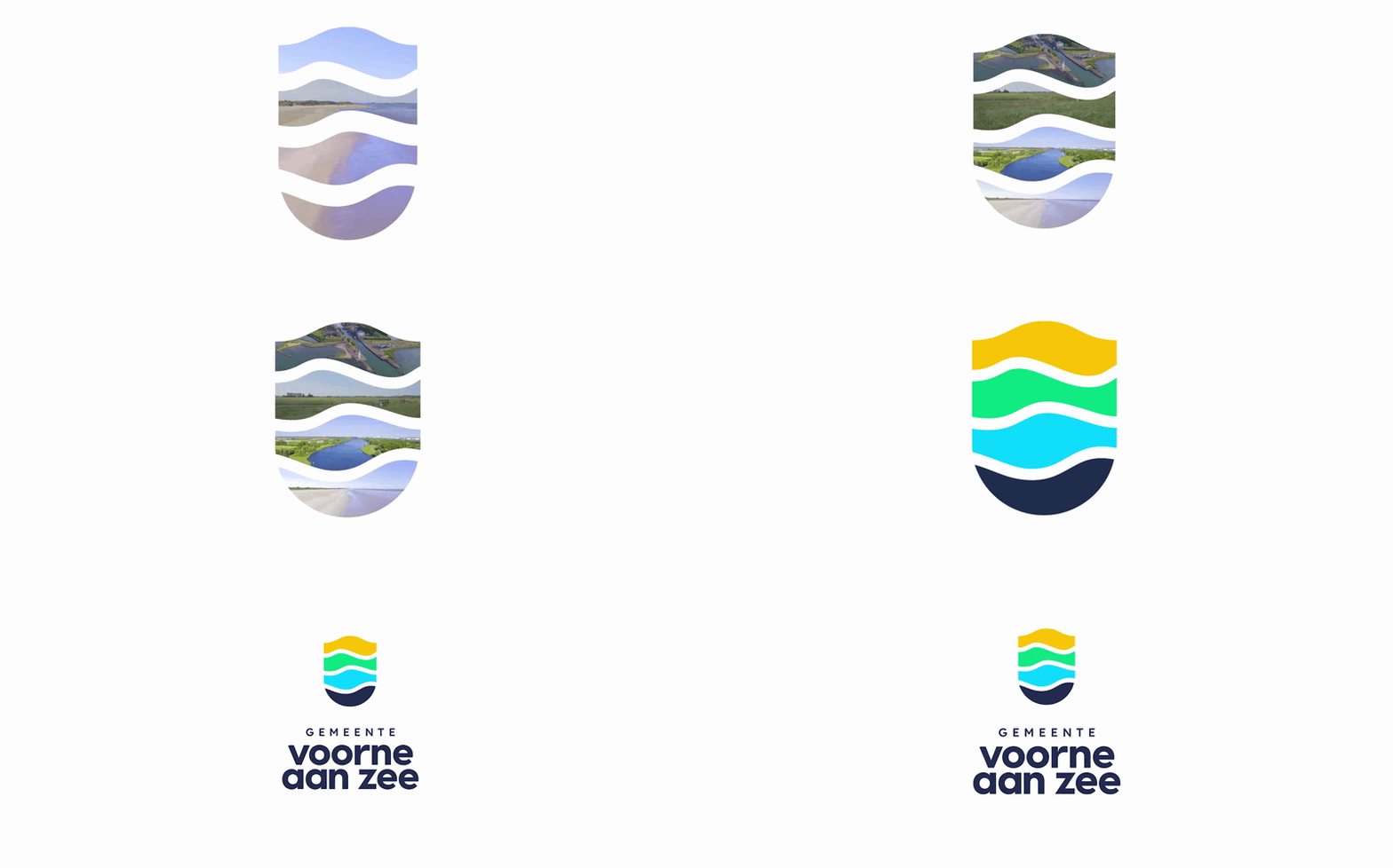
The new logo and identity are based on the geographical characteristics of the municipality. it embodies organic shapes that mirror the landscape and water bodies. The logo is a blend of elements, much like the towns coming together to form Voorne aan Zee.

Active participation and feedback from its residents was the starting point for designing the new identity. The residents envision the new municipality as a place that prioritizes health, with abundant opportunities for outdoor activities like cycling, walking, and water sports. Therefore, nature plays a big role in the design as well as prioritizing the preservation of nature. At the same time, tourism and recreation are vital for Voorne aan Zee’s economy, so it was crucial for the new brand to reflect the area’s appeal to visitors.
The Symbols
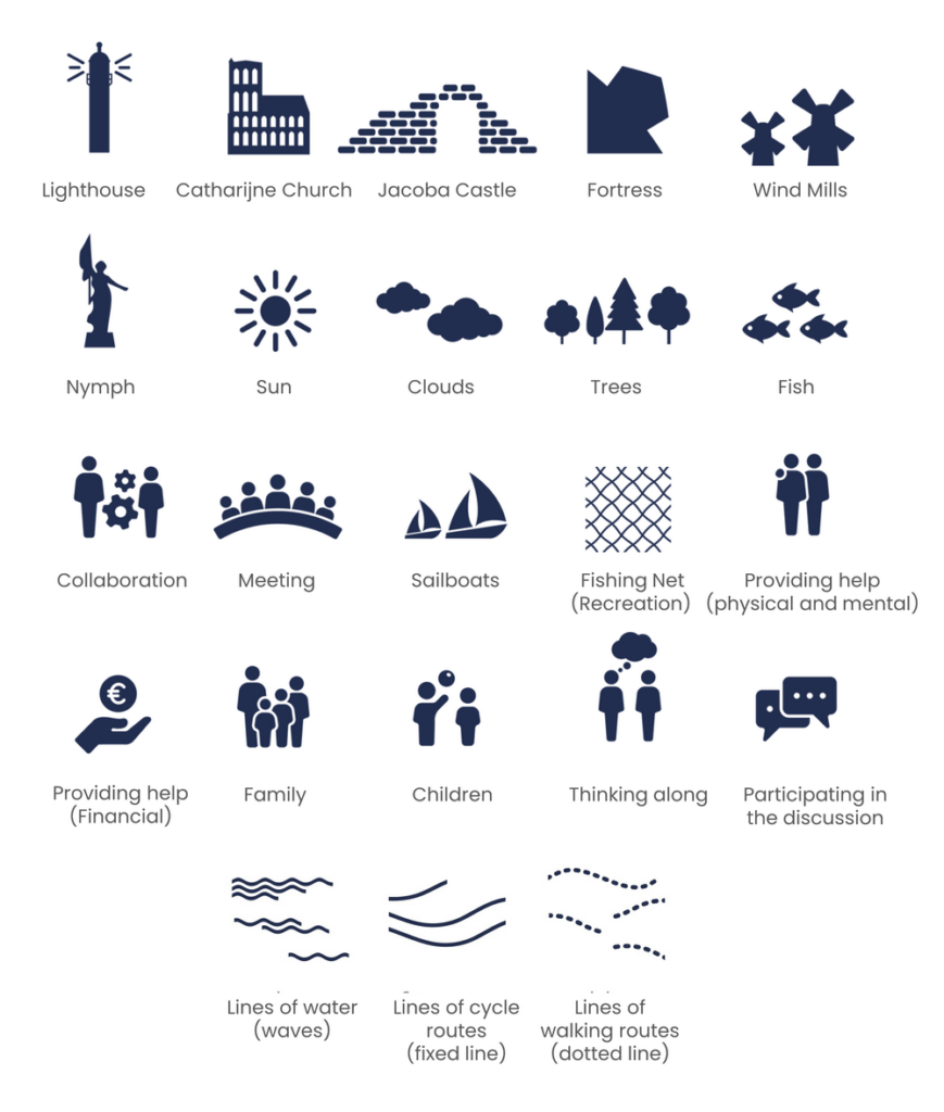
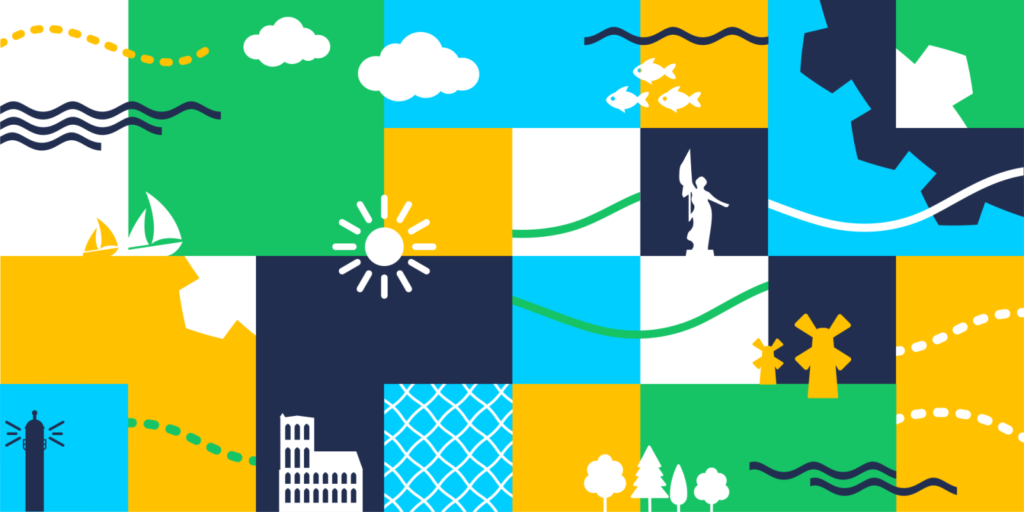
Each village and district retains its unique characteristics such as connecting, historical, natural, resilient, and personal through the logo and identity. The new identity radiates these unique characteristics through custom-designed symbols. Together they form the brand essence of pride.
- Historical: Lighthouse, Catharijne Church, Jacoba Castle, Fortress, Mills, Nymph*
- Nature: Sun, Clouds, Trees, Fish
- Connecting: Collaboration, Meeting, Sailboats and Fishing Net (recreation)
- Personal: Providing help (physical and mental), Providing help (financial), Family, Children
- Resilient: Thinking along, Participating in the discussion
Colors

Colors play a significant role in capturing the essence of the municipality. Ocher represents the sand and sun, while green symbolizes the lush grasslands and dunes. Blue reflects the inland waterways, while dark blue signifies the mighty sea that surrounds Voorne aan Zee.
Font
The font “Visby CF” chosen for the logo is modern and inviting, adding to its approachability and friendliness.
In conclusion, the new brand identity and logo for Voorne aan Zee capture the essence of the new dynamic municipality. With a focus on nature, history, and community, it’s a symbol of pride for residents and an invitation for visitors to explore and experience all that Voorne aan Zee has to offer.
- Province: Zuid-Holland
- Design Agency: Webnl
- Date of introduction: 1st January 2023
Logo Land is a compilation of all the municipality logos of the Netherlands. In this book, you will find the origin and meaning of the logo itself and of the shapes, forms and colours that have been carefully designed in each municipality logo. A pioneering effort, the first-ever book in Dutch history to archive and explain all municipality logos in the Netherlands.
Order the book here: amitbiswas.nl/logo-land


0 Comments