

The logo showcases the unique characteristics of the municipality, embodying the rich history, vibrant community, and forward-looking vision of the municipality.
The logo symbolises the sixteen villages that together form one municipality. The uniqueness of these villages is showcased through different coloured triangles. Together the triangles form the letter “H” symbolizing unity. The letter “H” is from the name “Horst aan de maas”.
The logo has a dynamic and progressive character with an upward line with each triangle pointing in multiple directions. The progressive design of the logo and the modern, fresh colours represent a developing municipality that working towards a healthy, safe and sustainable society.
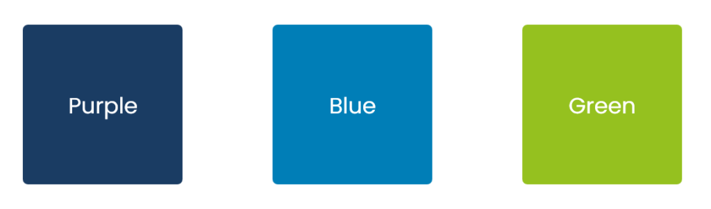
The logo and identity consist of three primary colours. Purple for our beautiful heather, Blue for water, the river Maas and the floodplains. The colour green stands for rural areas agriculture and a sustainable future.
With the powerful, recognisable and future-oriented logo and corporate identity, the municipality wants to present itself to residents, entrepreneurs, social partners and employees as a strong (employer’s) brand that fits in with the ongoing development and the strength of the sixteen villages of the municipality.
- Province: Limburg
- Designer/ Design Agency: Marketing Makkers and Kempen Creëert
- Date of introduction: 5th September 2022
Logo Land is a compilation of all the municipality logos of the Netherlands. In this book, you will find the origin and meaning of the logo itself and of the shapes, forms and colours that have been carefully designed in each municipality logo. A pioneering effort, the first-ever book in Dutch history to archive and explain all municipality logos in the Netherlands.
Order the book here: amitbiswas.nl/logo-land
0 Comments