The logo showcases the geographical characteristics of the region.
The new logo and corporate identity represent an upgrade from the former logo introduced in 2008 during the merger of Alkemade and Jacobswoude municipalities.
The municipal organization decided to upgrade to the new look and logo (2) without losing the recognizability factor of the former logo (1). With societal progress, the municipality recognized the need for a fresh approach to communication and presentation with its inhabitants. Hence the new logo and an extensive corporate identity style have been developed.
The new logo takes the shape of the blades of a windmill. The municipal region is home to many windmills. The municipality of Kaag en Braassem consists of eleven core villages and four hamlets (Bilderdam, Ofwegen, Vriezekoop and Zevenhuizen). Together they form the municipality of Kaag and Braassem. In inward pointing four form elements in the logo showcase the “connecting” factor among the villages and inhabitants (met elkaar). Through the logo and identity, the municipality wants to convey the message of enterprising, vital and united.
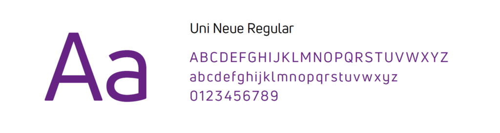
The type font for the corporate identity is the entire Uni Neue family. The particular type of font was chosen to give a professional and friendly look.
The logo and identity consist of two primary colours: strong purple and a fresh green. The colour green stands for rural nature, meadows and agriculture. The color purple represents a water-rich municipality.
- Province: Zuid-Holland
- Design Agency: Windkracht 10
- Year of Design: 2024
Logo Land is a compilation of all the municipality logos of the Netherlands. In this book, you will find the origin and meaning of the logo itself and of the shapes, forms and colours that have been carefully designed in each municipality logo. A pioneering effort, the first-ever book in Dutch history to archive and explain all municipality logos in the Netherlands.
For more info, visit this link: amitbiswas.nl/logo-land
Een hoop blablablabla. Kost een hoop geld en wat stelt het nou voor, het is maar een logo.
Haal er niets uit van wat jullie hierover schrijven en ik denk dat dit voor het gros van onze bevolking geld.
Voor mij een totaal onnodige actie geweest.
Het geld had beter besteed kunnen worden.
Hallo Jan,
Bedankt voor uw reactie. Aan alles wat we in ons leven doen, zijn kosten verbonden. Er zijn ook enorme kosten verbonden aan het niets doen. Als de gemeentebranding op de juiste manier wordt uitgevoerd, kan dit grotere economische voordelen opleveren voor de gemeente en het bedrijf.
Een goede case study zou de branding van de stad Eindhoven zijn. Als u tijd heeft, nodig ik u uit om er meer over te lezen. Link: https://placebrandobserver.com/how-eindhoven-uses-city-branding-strategies-for-economic-development-and-community-self-waardering/