

Gemeente Ommen
After more than 20 years, the municipality of Ommen is stepping into a new era with the introduction of its updated identity and logo. The logo showcases the unique characteristics of the municipality.
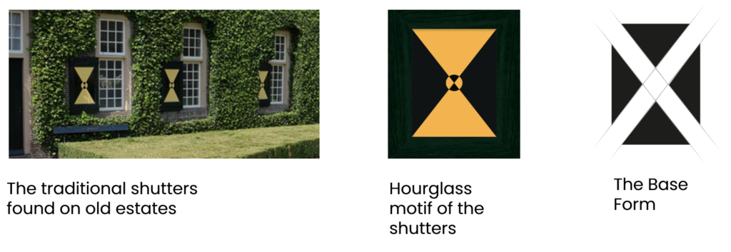
The new logo reflects the distinct features of the region, drawing inspiration from the traditional shutters found on old estates. All the shapes and icons are derived from the diagonal lines of the hourglass motif of the shutters. Various shapes together form the logo and showcase the diversity within Ommen. An accessible, hospitable community with a rich history. Present and past all come together. They all stand for something that illustrates the municipality:
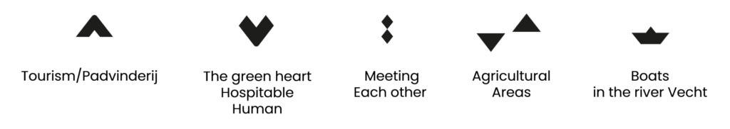
Through the new logo and identity, the municipality aims to convey the message of Ommen’s dynamic, down-to-earth and environmentally conscious character, emphasizing its unique offerings and potential for discovery. A municipality where present and past all come together, home to an accessible, hospitable community with a rich history. Elements in the logo specifically signified: tourism/scouting, the Vecht river, nature and hospitality, meeting and agricultural. These unique characteristics are achieved through a fresh, appealing, unique, human, dynamic, functional and subtle style.
Ommen’s Historical Heritage
Ommen boasts a rich historical heritage, including being home to Achterbroek, the oldest well-preserved agricultural area in the Netherlands. Also, Ommen is the birthplace of the Dutch Boy Scout (Padvinderij) movement in the early 20th century. Around 1920, the Eerde estate became the centre of the Boy Scout movement. The municipality region is also home to greenery, a river (the Vecht) and vast agricultural landscapes, offering tourists a tranquil yet dynamic retreat while providing residents and entrepreneurs with a sense of belonging.
Colors
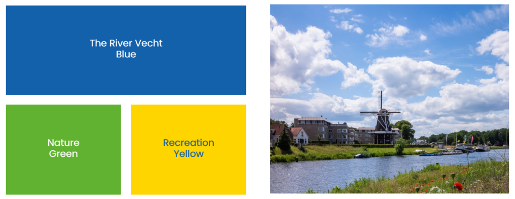
The primary colours of yellow and blue are derived from the historical coat of arms of the municipality and have been refreshed. The colour green represents agriculture and nature.
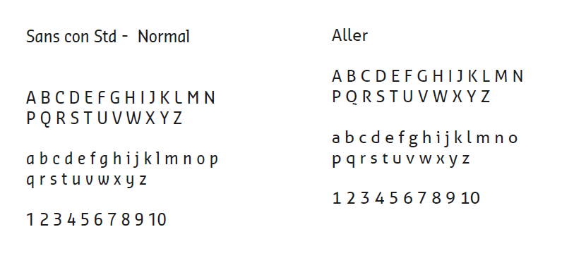
Complementing the logo are the official font types “Sans con Std” and “Aller” that embodies cleanliness, minimalism, friendliness, and modernity, aligning perfectly with the overall aesthetic of the new identity.
- Province: Overijssel
- Design Agency: Villa5
- Date of Introduction: 25 October 2022
Logo Land is a compilation of all the municipality logos of the Netherlands. In this book, you will find the origin and meaning of the logo itself and of the shapes, forms and colours that have been carefully designed in each municipality logo. A pioneering effort, the first-ever book in Dutch history to archive and explain all municipality logos in the Netherlands.
For more info, visit this link: amitbiswas.nl/logo-land
0 Comments