The municipality of Reusel-De Mierden has recently unveiled its refreshed logo and identity, marking a significant update after 26 years since 1997. The essence of this renewal is the motto: “Keep the good, improve the rest,” reflecting a commitment to building upon existing strengths while striving for continual improvement.
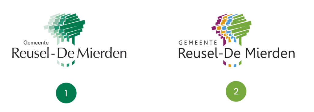
The new logo (2) is a renewed version of the former logo (1). The new logo (2) is based on the unique and geographical characteristics of the municipality.
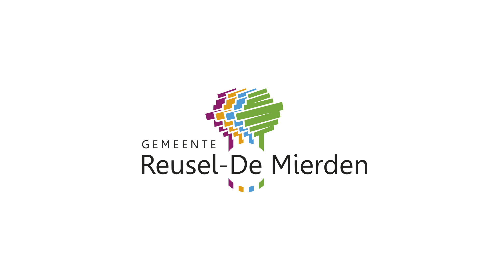
The logo consists of four trees that represent the four core villages under the municipality: Reusel, Hooge Mierde, Lage Mierde, and Hulsel. All these trees are connected by concentrating the image around the word “De” which symbolizes the unity among the core villages that form the municipality of Reusel-De Mierden. The four trees are in four different colours. All these colours together represent an active and dynamic community that is versatile and future-oriented.
Font Type

Compared to the former logo (1), the updated logo (2) places greater emphasis on the word ‘Gemeente’. The font Gisha Regular contributes a more contemporary, rounder and friendlier aesthetic.
Colours

The primary colour green represents the agricultural and recreational nature within the region. Other colours such as Blue, Yellowish Orange and Magenta stand for versatile, dynamic and future-oriented community.
- Province: Noord-Brabant
- Designer: The Communication team of Gemeente Reusel-De Mierden
- Date of Launch: October 2023
Logo Land is a compilation of all the municipality logos of the Netherlands. In this book, you will find the origin and meaning of the logo itself and of the shapes, forms and colours that have been carefully designed in each municipality logo. A pioneering effort, the first-ever book in Dutch history to archive and explain all municipality logos in the Netherlands.
Order the book here: amitbiswas.nl/logo-land

0 Comments