The municipality of Montfoort has recently unveiled a new logo and identity, refreshing its brand and public image. This update is part of a broader initiative to modernize the municipality’s visual representation and enhance its connection with residents and visitors.
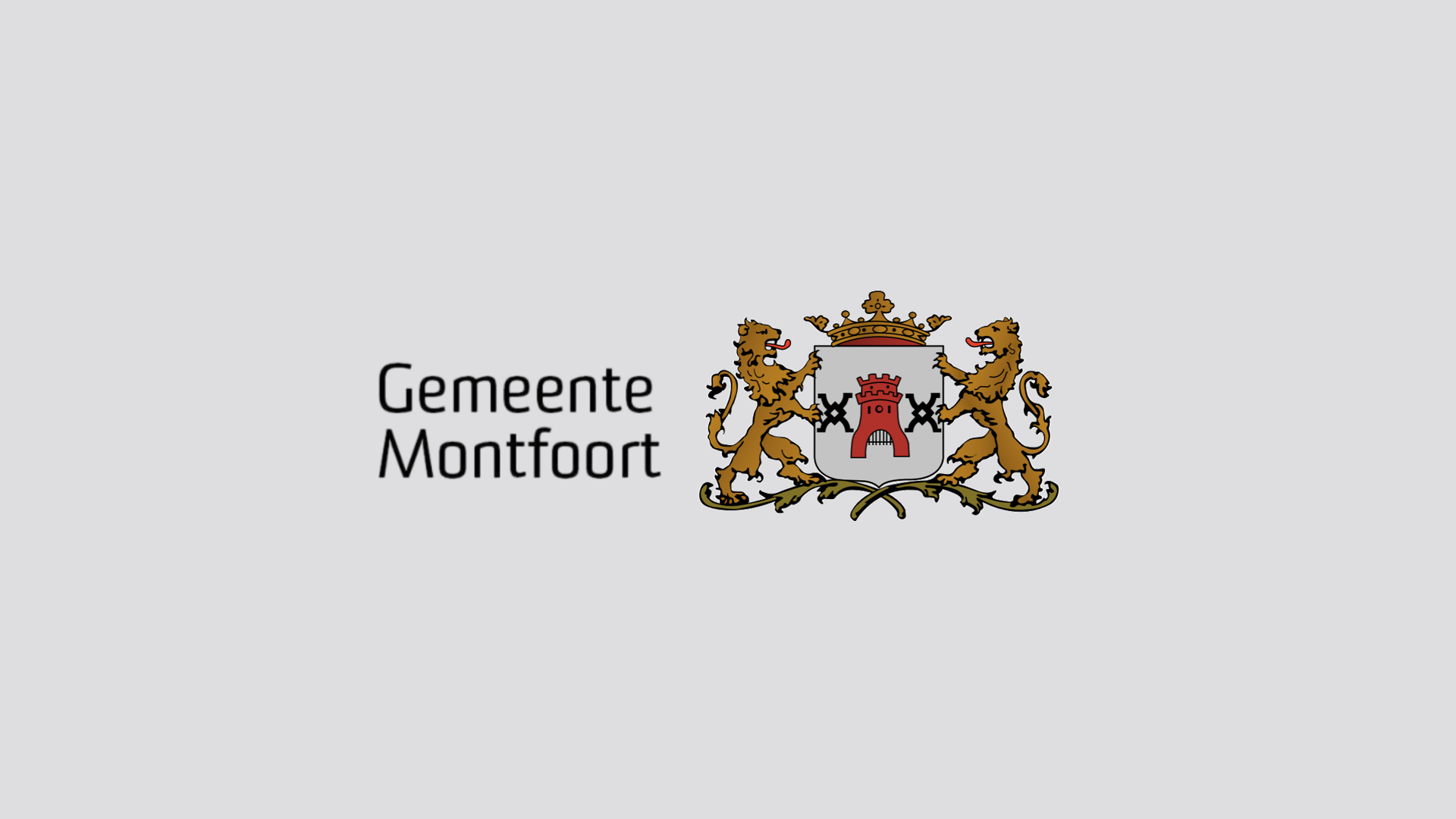
The new logo of Montfoort is designed to reflect the municipality’s heritage and forward-looking vision. The new logo consists of the coat of arms of the municipality and the wordmark “Gemeente Montfoort” in a new font.

The coat of arms contains the city gate with a portcullis in the middle and mill irons on the side. The city gate with a portcullis reflects the jurisdiction of the city in relation to the surrounding countryside. The mill irons are derived from the coat of arms of the De Rover family. The De Rover family was the viscount of Monfoort in the period 1283-1583. A mill iron is an important part of the grinding of a flour mill. The mill irons on the coat of arms refer to the mill/wind law. The De Rover family owned the rights to run the mills in Montfoort.
Font

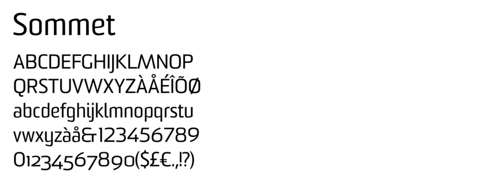
The wordmark “Gemeente Montfoort” is in “Sommet” font. Choosing a contemporary font like Sommet gives the municipality a more modern and dynamic look, which aligns with current design trends. Additionally, Arial is used for the body text due to its readability and clarity.
Colours

The new identity includes a fresh colour palette of red and blue. The red is derived from the historical coat of arms of Montfoort, maintaining a link to Montfoort’s past. While the color Blue adds a contemporary touch, giving the identity a renewed and energetic look.
Additionally, a new form element has been introduced in the new corporate identity: a red line with a dot. The red dot is a reference to the historical nickname of Montfoort residents as ‘button turners’ (knopendraaiers in Dutch) and Linschoten residents as ‘ball snackers’ (balensnoepers in Dutch). In the 18th century, a flourishing button-turning industry developed in Montfoort, with dozens of button-turners active in the city. These artisans made buttons from bones, which became an important part of the local economy. The production of buttons became so characteristic of Montfoort that the inhabitants were nicknamed ‘button turners’. This nickname is deeply rooted in the city’s history and is still used today. In Linschoten, sweet “balls” were used to sweeten coffee or tea instead of expensive sugar. Held in the mouth while drinking, these balls were saved and reused for the next cup, The dot with the red line is a link to the historical custom in Linschoten emphasizing thriftiness in earlier times
- Province: Utrecht
- Designed by: De ReclameHelden
- Introduction date: 19th April 2022
Logo Land is a compilation of all the municipality logos of the Netherlands. In this book, you will find the origin and meaning of the logo itself and of the shapes, forms and colours that have been carefully designed in each municipality logo. A pioneering effort, the first-ever book in Dutch history to archive and explain all municipality logos in the Netherlands.
Order the book here: amitbiswas.nl/logo-land


0 Comments