

The logo showcases the unique characteristics of the municipality.
The logo symbolizes the shared values and flourishing growth in the municipality of Kapelle. Comprising a thoughtful combination of elements, the logo conveys a narrative of unity and unique characteristics. At its core, the logo features a square, symbolizing the unity of the municipality. Within this square, leaves take the form of location pins, representing the four villages—Kapelle, Wemeldinge, Biezelinge, and Schore.
These leaves also subtly shape a blossom, alluding to the municipality’s blooming character. Situated within the fruit-rich province of Zeeland, Kapelle’s growth in the early 20th century is symbolized by the fruit orchards and related activities. The ‘G’ for Municipality and the ‘K’ for Kapelle, along with diagonal lines, reflect the cohesive communities of Eversdijk and Abbekinderen.
Previously the municipality used two different versions of the logo depending on the usage. For offline communication such as printed material, the municipality used the logo (1) with the aerial map of the municipality. For online communication such as website and social media channels the logo (2) was used.
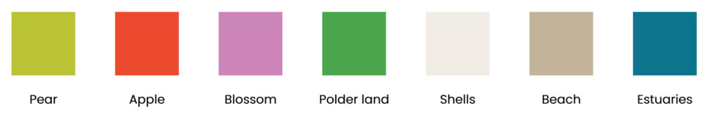
The identity consists of various colours inspired by Pear, Apple, Blossom, Polderland, Shells, Beach and estuaries.
The municipality also uses several icons corresponding to different themes such as “Green”, “Entrepreneurial” and “Fruit”. There are various colours, each representing a characteristic of the municipality.
The municipality took the collaborative and research-based approach to gather ideas and inspiration by involving the municipal council, the employees, residents, entrepreneurs, students and tourists. After 25 years, the new logo and identity for Kapelle municipality serve as a unifying symbol for its rich history, shared values, and growth clearly and professionally.
- Province: Zeeland
- Designer: BlackDesk (www.blackdesk.nl)
- Year of Design: 2023
Logo Land is a compilation of all the municipality logos of the Netherlands. In this book, you will find the origin and meaning of the logo itself and of the shapes, forms and colours that have been carefully designed in each municipality logo. A pioneering effort, the first-ever book in Dutch history to archive and explain all municipality logos in the Netherlands. For more info, visit this link: amitbiswas.nl/logo-land
0 Comments