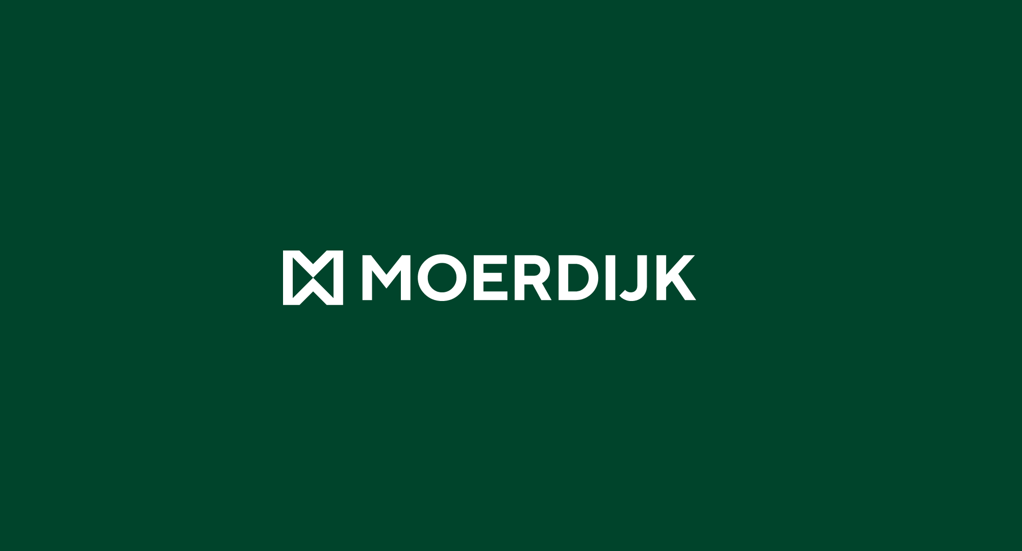
The logo showcases the unique characteristics of the municipality.
Inspired by the renowned Moerdijk Bridge and the adjacent monument, the logo serves as a symbolic representation of the municipality’s identity. The inclusion of the iconic bridge, known for evoking a sense of homecoming, serves as a focal point in the logo’s composition. Furthermore, the incorporation of the letter “M” from the name Moerdijk reinforces recognizability, while the oblique lines derived from the municipality’s coat of arms add a touch of elegance.

To reflect the municipality’s progress and forward-thinking approach, an upward line is strategically integrated into the design, symbolizing growth and development. This element signifies the Municipality of Moerdijk’s commitment to moving forward and embracing new opportunities.

The choice of the color green as the foundation of the new house style was influenced by valuable input from the residents. Additionally, the historical significance of the color green in the municipality’s coat of arms played a significant role in its selection. Green represents the abundance of green spaces, thriving agriculture, and the municipality’s dedication to environmental consciousness. By incorporating this color into the new house style, the Municipality of Moerdijk aims to showcase its deep connection to nature and foster a sense of harmony and sustainability within the community.
Overall, the logo embodies the values of recognizability, simplicity, and strength. It serves as a modern representation of the municipality, replacing the previous logo that was created 26 years ago for paper-based communication. With the launch of the new house style on June 12th, 2023, the Municipality of Moerdijk endeavours to better meet the contemporary communication requirements of today’s world.
- Province: Noord-Brabant
- Designer: BRANDBITS® (www.brandbits.nl)
- Year of Design: 2023
Logo Land is a compilation of all the municipality logos of the Netherlands. In this book, you will find the origin and meaning of the logo itself and of the shapes, forms and colours that have been carefully designed in each municipality logo. Logo Land has been featured in the leading newspapers and media channels such de Volkskrant, Reformatorisch Dagblad, Omroep Zeeland, RTV Drenthe, VNG Magazine, FRITS, Binnenland Bestuur, Nationale Ziekenomroep radio and RaRaRadio. The book ranked in the top 20 in the Boekhandel Van Piere top-selling book in CW 43.

0 Comments