
Venlo’s new logo is a modern identity based on the vision and shared values of connection, celebration, entrepreneurship and community of the municipality. The new logo and visual identity were officially launched and revealed on 1 December 2025 during a public event in Maaspoort in Venlo.
The new logo and identity beautifully capture’s the municipality’s vibrant character and evolving aspirations. It has been designed to reflect both Venlo’s deep community bonds and its forward-looking outlook.
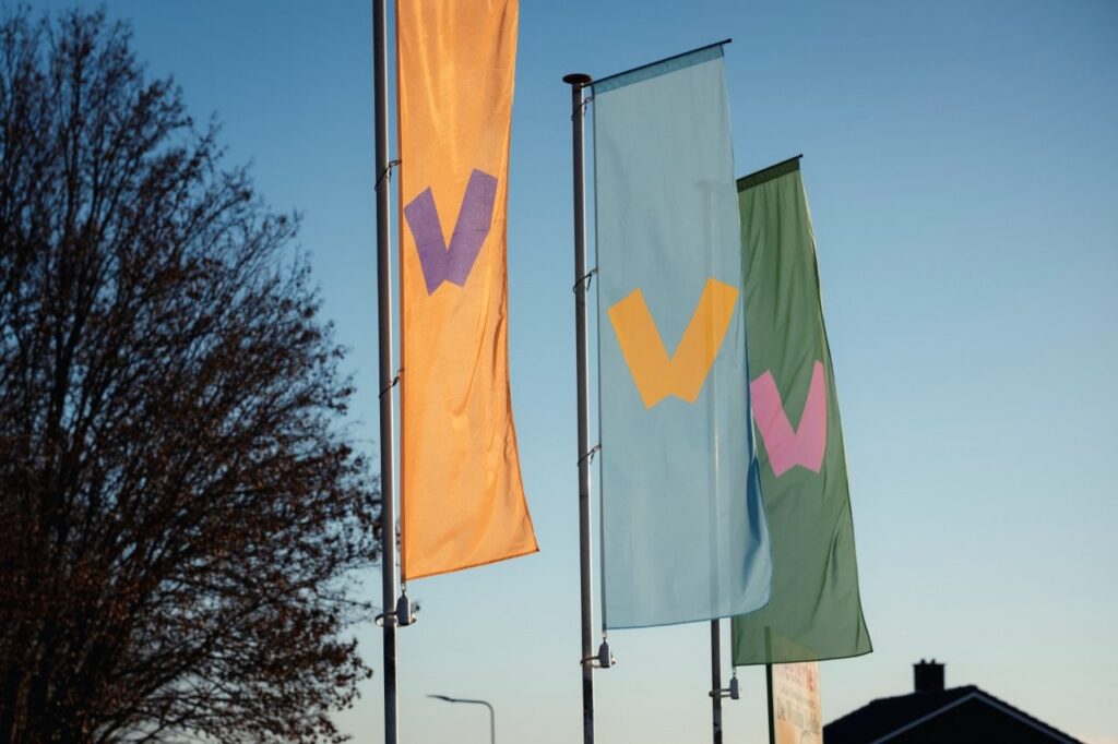
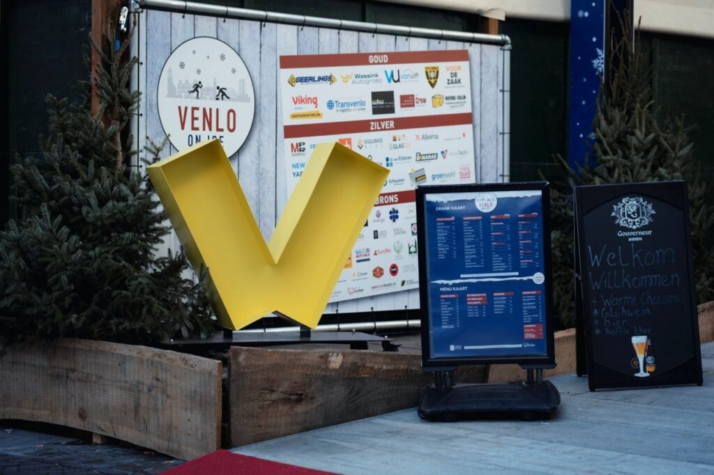
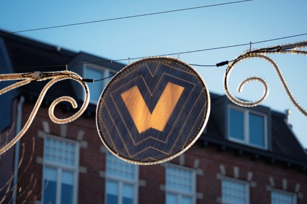
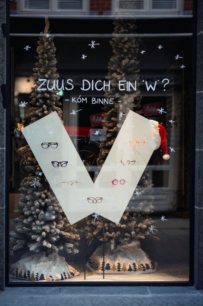
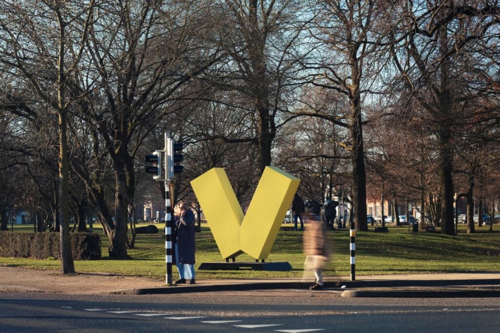
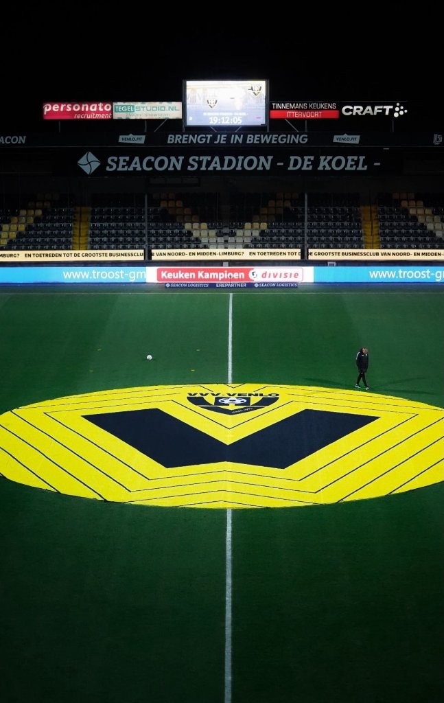
The new logo centers on a bold, dynamic “V” mark that has been crafted to represent connection of enjoying nature, celebrating life together, and dynamic entrepreneurship. At the same time, caring for one another, seeing each other in a social context.
A Symbol of Connection and Values
At its core, Venlo’s new logo represents key aspects of the municipality’s identity:
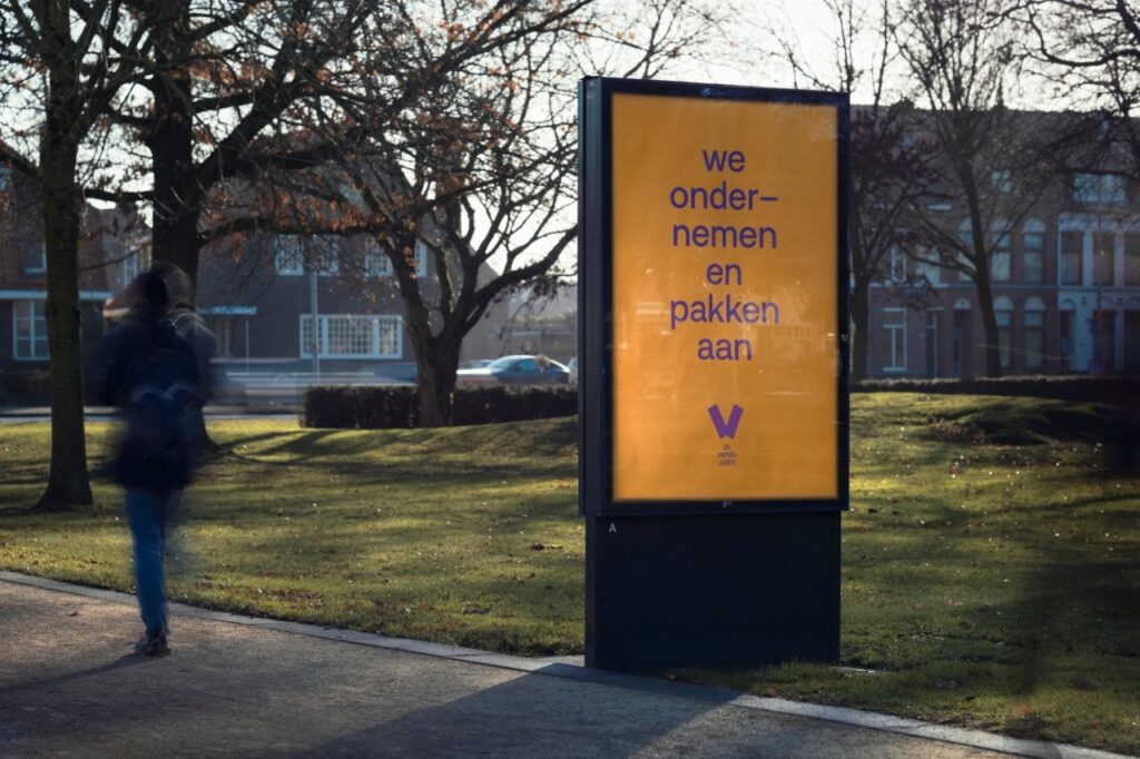
Entrepreneurial Energy: Venlo is known for its entrepreneurial heart and innovative economy. The clean, contemporary lines of the “V” speak to this energetic and forward-looking mindset.
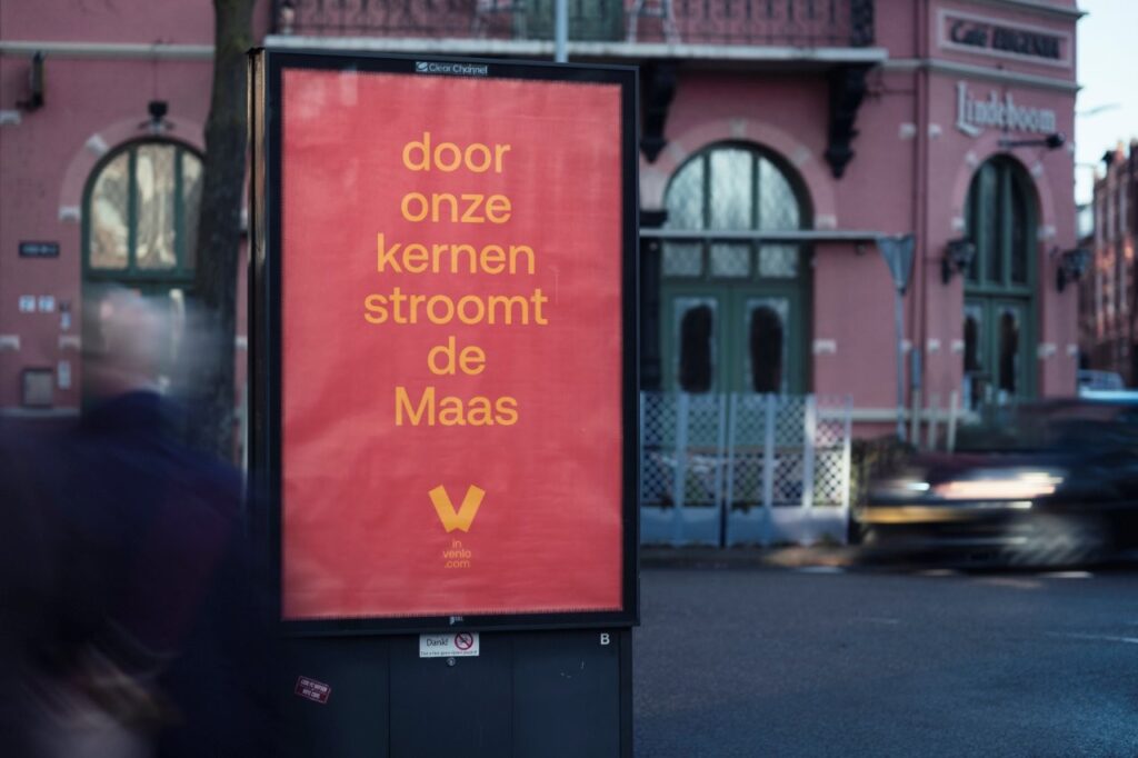
Unity and Togetherness: The “V” symbol stands for verbinding (connection) and samen (together), highlighting the city’s strong community spirit and collaborative nature.
Celebration and Culture: With an emphasis on shared experiences, the mark reflects how people in Venlo celebrate life and culture together, reinforcing the city’s reputation as a welcoming and lively place.
Is Venlo the second open-source municipal logo in the Netherlands?
Yes. Venlo’s new V-mark follows Eindhoven’s pioneering example as an open-source city symbol. The standalone mark is free for everyone to use, while the official municipal logo with the wordmark and reserved colour remain protected and require permission. Here’s how Venlo’s approach compares to Eindhoven’s:
Typography
Typography plays a key role in bringing the Venlo identity to life. The Aeonik typeface was selected as the primary font for its clarity, warmth and modern character. Aeonik combines clean geometric shapes with subtle humanist details, creating a balance that feels both approachable and confident. Perfectly aligned with Venlo’s vision and core values.
Colours
The Venlo identity is supported by a vibrant and carefully curated colour palette.
These colours are selected to reflect the energy, openness and diversity of the municipality and can be freely used across communication and city marketing, as long as designers maintain strong contrast and readability. This balance ensures Venlo always feels warm, positive and unmistakably itself, no matter where the logo appears.
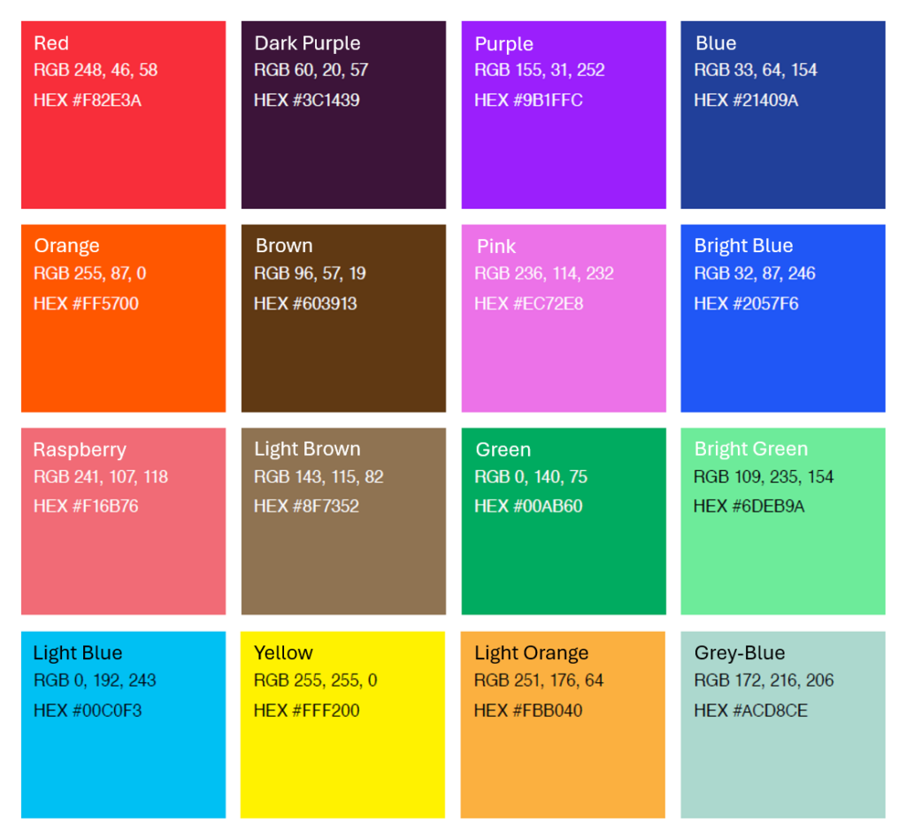
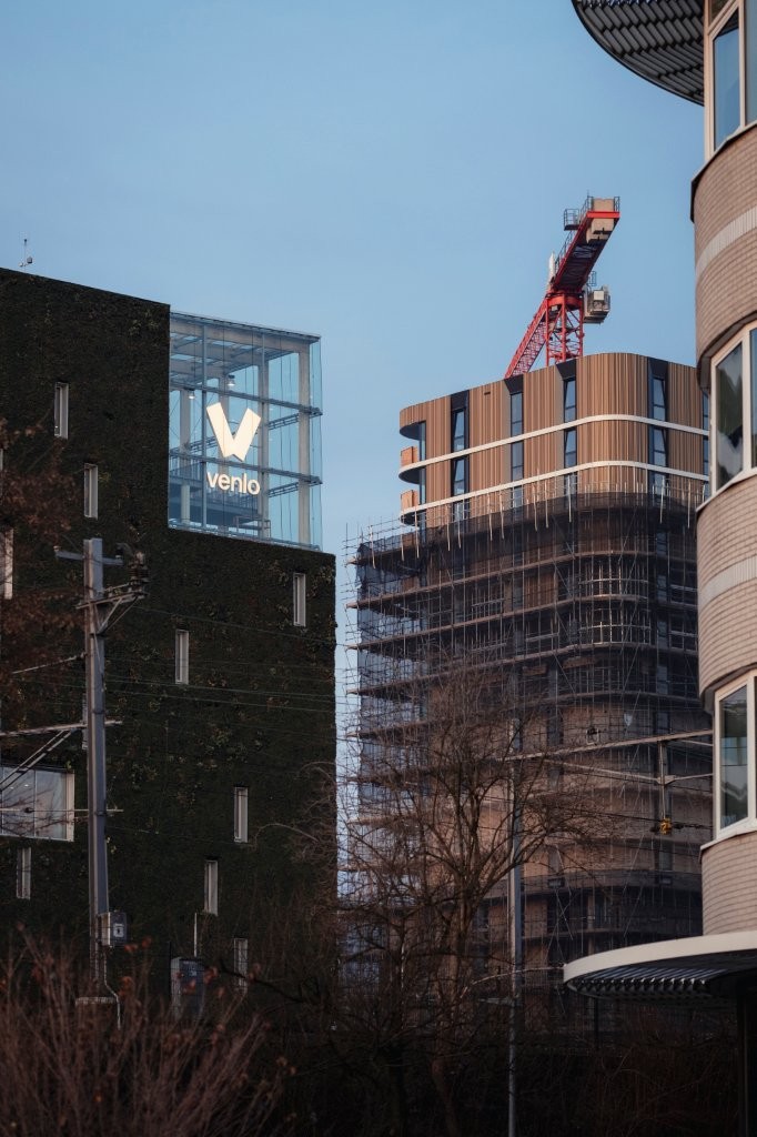
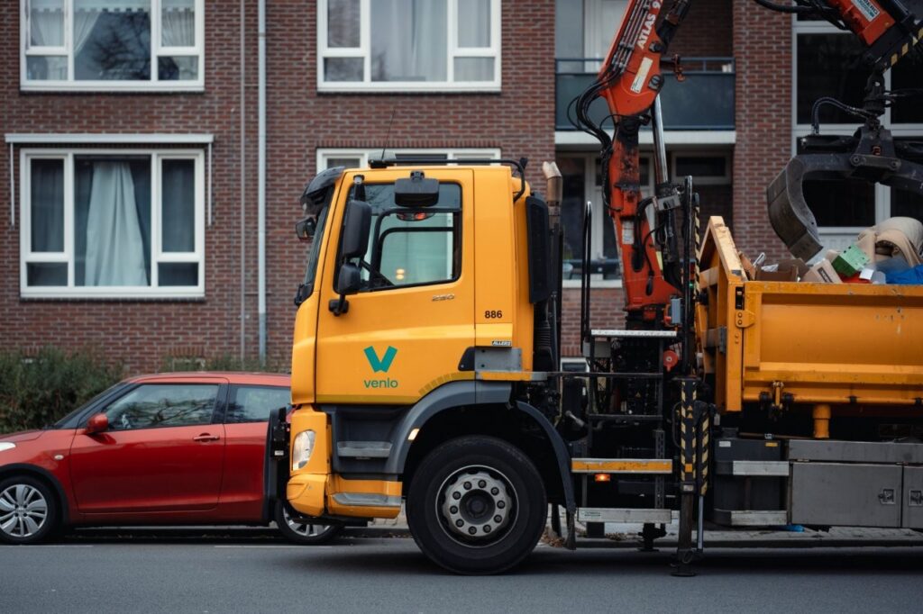
Venlo’s New Identity in Action
- Province: Limburg
- Design Agencies: Luidspreker and Studio Denk
- Led by: Venlo Partners
- Date of Introduction: December 2025
With the launch of the Netherlands’ second open-source municipal identity, Venlo steps boldly into a new chapter defined not by boundaries or bureaucracy, but by a shared vision built on ownership, creativity and trust in its people. This logo represents far more than a visual refresh; it is a declaration of confidence in who Venlo is becoming. After a two-year journey shaped by thousands of voices, branding and design process, Venlo now steps forward united behind a symbol that truly belongs to everyone.
About the Book
Logo Land is a compilation of all the municipality logos of the Netherlands. In this book, you will find the origin and meaning of the logo itself and of the shapes, forms and colours that have been carefully designed in each municipality logo. A pioneering effort, the first-ever book in Dutch history to archive and explain all municipality logos in the Netherlands.
Order the book here: amitbiswas.nl/logo-land
0 Comments