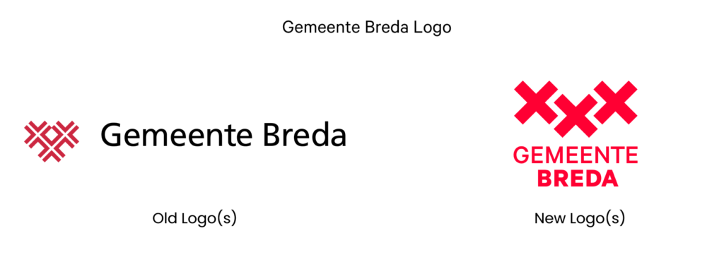
The municipality of Breda has recently introduced a fresh and contemporary logo, marking a significant update to its visual identity. This rebrand, launched in September 2023, brings a modern touch while maintaining the historic elements that have defined Breda for centuries.
A Logo with Deep Historical Roots
The new logo’s most prominent feature is the retention of the three St Andrew’s crosses, a symbol deeply rooted in Breda’s history. This design traces back to the historic coat of arms, which featured three St Andrew’s crosses on a red shield. In the early 12th century, Breda was under the rule of the Van Breda family, whose coat of arms influenced Breda’s historic coat of arms.
The previous logo, which was added in 2016, featured openwork crosses and the slogan “Breda brings it together” (“Breda brengt het samen”). Over the years, various versions of the logo appeared, often lacking consistency.
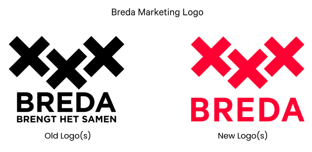
The new logo and identity maintain the essence of the three red St Andrew’s crosses, now depicted with evenly filled lines. The Breda city marketing uses the logo with three crosses with the wordmark “BREDA” (without ‘brings it together’) as the logo for the city. It stands for renewal, connection and together and refers to the Story of Breda. The municipality uses the logo with three crosses and the wordmark “GEMEENTE BREDA” for official communications.
The slogan “Breda brings it together” (“Breda brengt het samen”) remains, reflecting Breda’s commitment to unifying diverse elements within the city—whether connecting urban life with natural spaces or blending the vibrancy of a big city with the charm of a close-knit village.
Breda’s DNA: A City of Quality
The new identity was shaped through extensive consultation with residents, entrepreneurs, and experts, all aiming to capture Breda’s unique character. Breda wants to position itself as an international city with three key (3Gs) attributes:
- ◼️ Limitless (Grenzeloos): Breda is a city with boundless creativity and global connections.
- ◼️ Green (Groen): Breda aims to be recognized as a “City in a Park” by 2030, emphasizing its commitment to sustainability and green spaces.
- ◼️ Hospitable (Gastvrij): Breda is a welcoming city, known for its warmth and friendliness.
These three attributes are symbolized by the city’s three crosses, representing the 3Gs that define Breda’s forward-looking vision.
Font

The primary font for Breda’s new identity is Inter font family, chosen for its contemporary and friendly appearance. Inter font is also an open-source font from Google. Arial serves as the secondary font, selected for its readability and suitability for digital platforms.
Colors
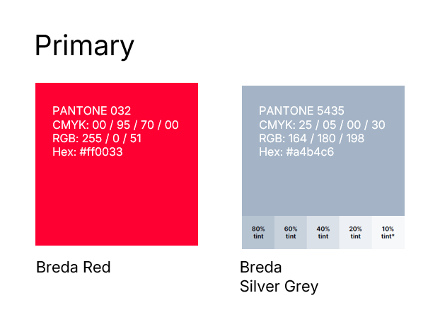
The main colour of the Municipality of Breda is red, a choice rooted in the city’s rich history, as seen in its coat of arms. Consistently using this red colour enhances the city’s recognizability. To highlight the municipality’s seriousness and role as a government organization, silver-grey is also used. This silver-grey comes in different shades and is often combined with white and red.
Breda’s new logo and visual identity perfectly capture the city’s evolution over time. By blending historic symbols with modern design elements, Breda is reinforcing its position as a city that honours its past, and connection with its residents while looking forward to the future.
- Province: Noord-Brabant
- Design Agency: Fama Volat
- Date of Introduction: September 2023
Logo Land is a compilation of all the municipality logos of the Netherlands. In this book, you will find the origin and meaning of the logo itself and of the shapes, forms and colours that have been carefully designed in each municipality logo. A pioneering effort, the first-ever book in Dutch history to archive and explain all municipality logos in the Netherlands.
Order the book here: amitbiswas.nl/logo-land


0 Comments