The logo showcases the unique characteristics of the municipality and the vision of the municipal organization.
On January 1, 2022, the municipalities of Beemster and Purmerend will merge. With the merger of both municipalities, a new municipality will be created, which will be called Purmerend. The connection between Beemster and Purmerend is reflected in the logo in various ways.
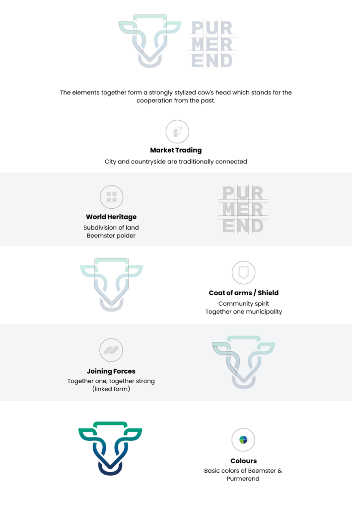
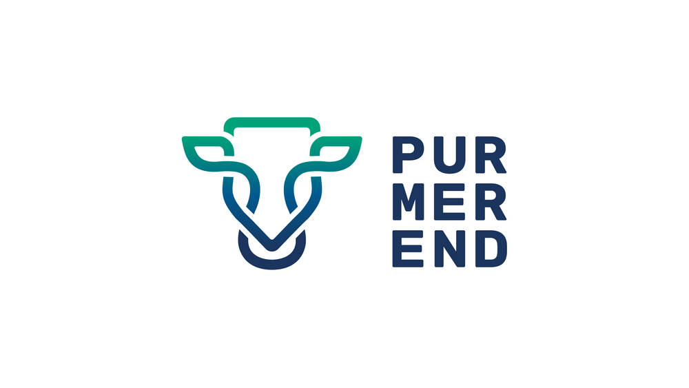
Historically, Beemster and Purmerend share a special bond as the livestock and products from the Beemster were traded in the past on the markets in Purmerend. At the same time, Beemster and Purmerend is home to several dykes, open agricultural landscapes, historic city centres, urban facilities, villages and neighbourhoods, markets and the UNESCO World Heritage designations. All these unique characteristics together give the new municipality a diverse character and strong regional position. The looped form element on the logo form a chain and represent that joining forces. The looped lines together form a shield and a highly stylized cow’s head. The shield represents a sense of community and being one together. The letters next to the logo are positioned at equal intervals, similar to the land development in the Beemsterpolder. Historically Beemster was a large lake. In the middle ages, the lake was drained using windmills to create a polder for agricultural purposes. Beemster is a symbol of dutch water management and land reclamation. The rich history and landscape of Beemster are portrayed through letters and their positioning.
The moving blue and green colour tones are derived from the current corporate identity of Beemster and Purmerend and represent the merger in the new municipality of Purmerend.
- Province: Noord-Holland
- Designer: Devani Creative (www.devani.nl)
- Year of Design: 2021
Logo Land is a compilation of all the municipality logos of the Netherlands. In this book, you will find the origin and meaning of the logo itself and of the shapes, forms and colours that have been carefully designed in each municipality logo. Logo Land has featured in the leading newspapers and media channels such de Volkskrant, Reformatorisch Dagblad, Omroep Zeeland, RTV Drenthe, VNG Magazine, FRITS, Binnenland Bestuur, Nationale Ziekenomroep radio and RaRaRadio. The book ranked in the top 20 in the Boekhandel Van Piere top-selling book in CW 43.

0 Comments