The municipality of Terneuzen has recently launched a fresh and innovative new logo, marking a significant update to its visual identity. This rebrand comes after 21 years of using the previous logo, which had been in place since the merger with Axel and Sas van Gent in 2003.
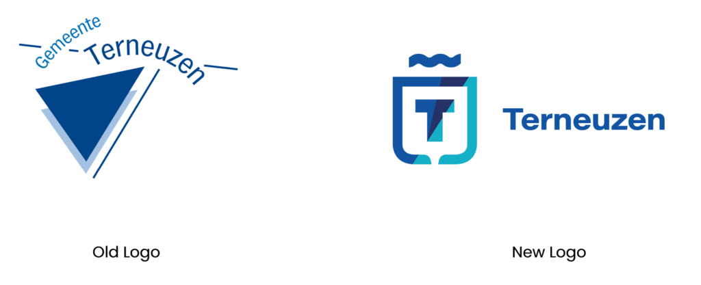
The new logo is based on the unique characteristics of the municipality. The logo consists of various elements. The “T” stands for Terneuzen and is surrounded by a shape that serves a dual purpose: it resembles the front of a container ship and at the same time echoes the design of a traditional coat of arms. This design choice is deeply symbolic, representing Terneuzen’s identity as a port city, maritime trade and its history.
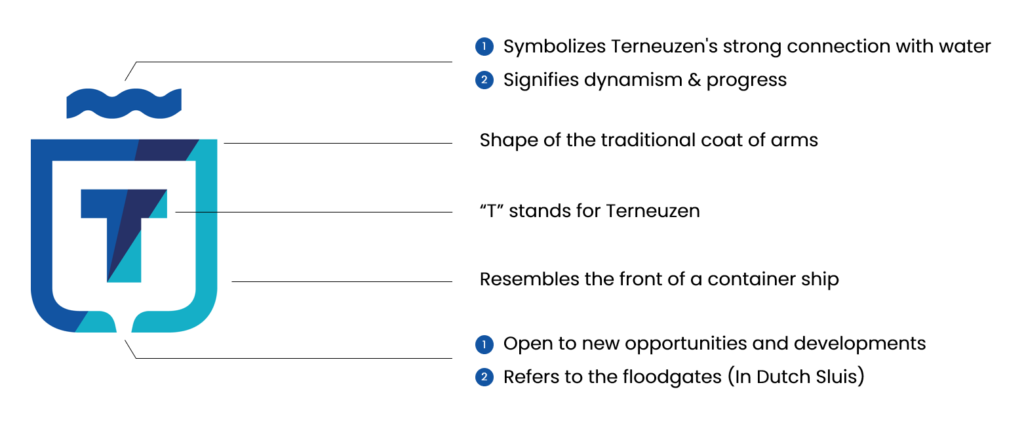
The space around the “T” and the opening at the bottom of the shape are particularly meaningful. This opening signifies an “open view to the outside,” metaphorically representing the municipality’s openness and accessibility; It suggests that Terneuzen is open to new opportunities and developments, much like a metaphorical floodgate.
Additionally, the design also mimics the appearance of a lock gate, a nod to the iconic locks integral to Terneuzen’s port operations. With the upcoming opening of the Nieuwe Sluis in 2024, the lock door in the logo highlights this crucial infrastructure development. It will improve the port’s accessibility and strengthen Terneuzen’s position as an important port city. The locked door also references the coat of arms of the former municipality of Sas van Gent, creating a link with the past and emphasizing Terneuzen’s historical roots.
The wave movement in the new logo has double symbolism. It represents Terneuzen’s strong connection with water, essential to the municipality’s identity due to its port location and proximity to waterways. Additionally, the wave signifies dynamism and progress, reflecting the municipality’s ambition to develop and modernize. This aligns with Terneuzen’s broader goals to be an attractive and forward-looking municipality.

Font:

The logo and identity use “Acumin Pro Wide,” a strong and distinctive font renowned for its excellent readability. This choice ensures clarity and accessibility for a broad audience.
Colors:
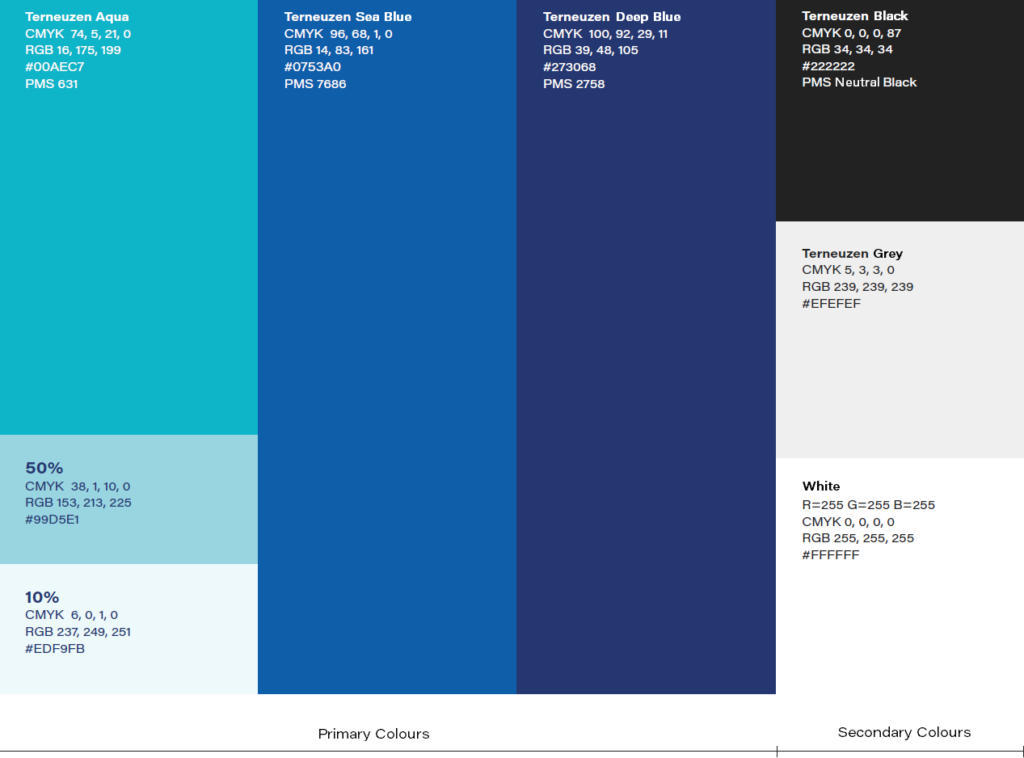
The identity uses 3 colors of blue reinforcing Terneuzen’s identity. At the same time, secondary colours like black and grey and some shades of blue are used for branding purposes.
Overall, Terneuzen’s new brand concept and visual identity celebrate its unique position as a connector of contrasts. The region’s diverse elements—water and land, Zeeland and Flanders, village and city, nature and industry, peace and dynamism—are all reflected in the logo.

The new logo is also used by Citymarketing Terneuzen but with different colours. The new identity was recently awarded the “Best Brand Award” by a jury of international branding experts. This strengthens the municipality’s recognisability and creates a more powerful image, which is essential for positioning Terneuzen in the region.
- Province: Zeeland
- Design Agency: Nilsson
- Introduction Date: January 10, 2024
Logo Land is a compilation of all the municipality logos of the Netherlands. In this book, you will find the origin and meaning of the logo itself and of the shapes, forms and colours that have been carefully designed in each municipality logo. A pioneering effort, the first-ever book in Dutch history to archive and explain all municipality logos in the Netherlands.
Order the book here: amitbiswas.nl/logo-land


0 Comments