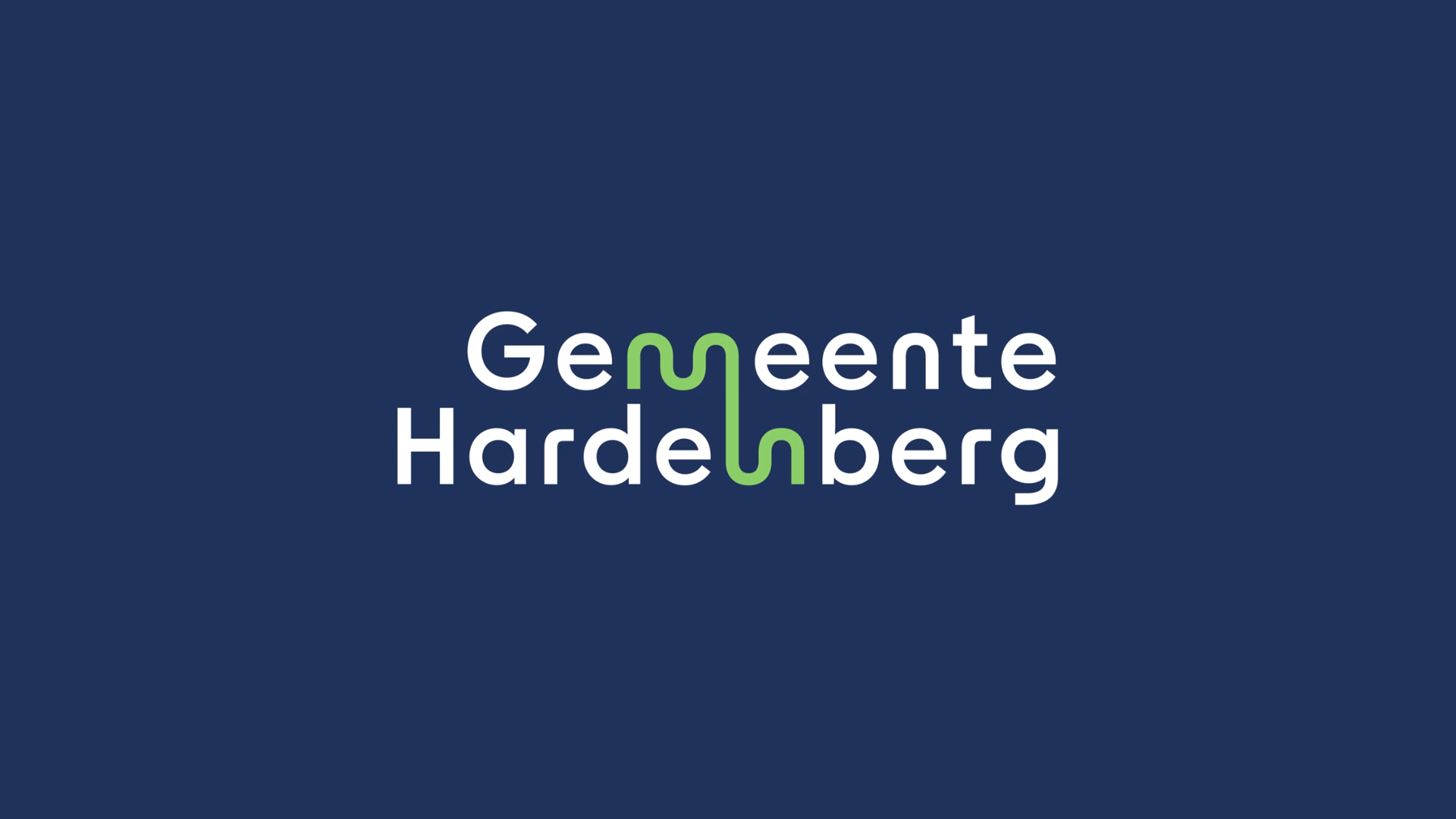
After over two decades, the Municipality of Hardenberg is embracing a new era with the introduction of its refreshed identity and logo. The new logo symbolizes a dynamic blend of tradition and progress, reflecting the changing landscape and aspirations of the municipal region.

The core of the logo and the new identity is the connection between the city, the centres and the surrounding countryside. The new logo consists of the words ‘Gemeente’ and ‘Hardenberg’ and has round shapes. The rivers Reest and Vecht are illustrated as a green wavey element. The wavey elements (rivers) connect the words ‘Gemeente’ and ‘Hardenberg’ together. Together with the unifying green element, the logo symbolizes the unified integration of urban and rural landscapes, symbolizing Hardenberg’s commitment to connectivity and inclusivity.
Beyond the aesthetics, the logo stands for dynamism, decisiveness, entrepreneurship and development. At the same time, it symbolizes tourism, peace and space.

Colours
The prime colour dark blue stands for connection, green stands for nature, yellow for ambition/strength and pink represents the human factor. Altogether, the round shapes and soft colours give the logo a personal, human and warm character.
- Province: Overijssel
- Design Agency: Buro Open
- Date of Introduction: 31 January 2024
Logo Land is a compilation of all the municipality logos of the Netherlands. In this book, you will find the origin and meaning of the logo itself and of the shapes, forms and colours that have been carefully designed in each municipality logo. A pioneering effort, the first-ever book in Dutch history to archive and explain all municipality logos in the Netherlands.
Order the book here: amitbiswas.nl/logo-land

0 Comments