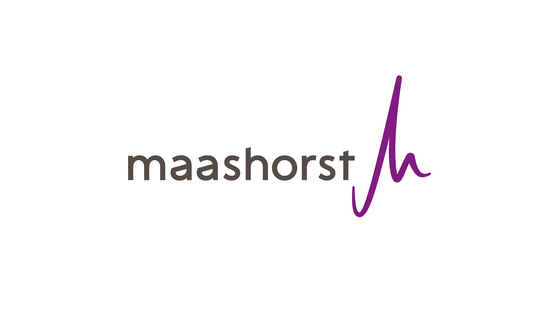
The logo showcases the unique characteristics of the municipality and the vision of the municipal organization.
On January 1, 2022: the municipalities of Uden and Landerd will merge as one municipality of Maashorst.
The Pulse shaped logo; similar to a heartbeat is the lifeline of society and refers to the bustling centre. The pulse shape is created through a combination of two letters “m” & “h” from the name Maashorst. The core six villages of Odiliapeel, Reek, Schaijk, Uden, Volkel and Zeeland are portrayed in every ‘curve’ in the logo. The logo also resembles a signature; highlighting uniqueness similar to an artist’s signature. The logo also highlights the geographical features such as upward (in Dutch Horst), downwards (in Dutch Slenk) slope, and meander (the sinuous curves in the channel of the river Maas) within the region.

Maashorst is a new municipality that is full of energy, dynamism and at the same time open-minded, warm and accessible to the people. The balance between tourist ambitions and conservation of the nature reserve is an important vision of the municipality. The free form shape of the logo with friendly curves and various subtle symbolic references captures all the unique characteristics and the long-term vision of the municipal organization.
The logo is used both with and without the wordmark Maashorst. The wordmark Maashorst is designed with a tailor-made font “Horstenslenk”. The Pulse can be used as a separate element.
The primary colour of purple refers to the blooming heather and stands for emotions, magic, dignity, vision, truth, wisdom, daring to be different. The grey colour is a neutral, close-fitting supportive colour. The corporate identity also includes two more colours of forest green and sand yellow. The forest green stands for development, life, balance and harmony, the tranquillity of nature, renewal. The sand yellow represents pleasure, happiness, self-confidence, decisive, active and curiosity.
Video explanation of the logo and identity :
- Province: Noord-Brabant
- Designer: Creative Co-Creation team (Vincent van Gaal: VANGAAL design, Derk Peters: Circa Twee, Frank Wassenberg: TIKKL, Pablo Slenders: Studio Edison, Pascal Hollart: DAVID and Peter van Gerwen: Gerwen online en offline reclame. Project lead by Ad van Antwerpen: ADEKWAAD and Malou Verhagen: Gemeente Uden (Currently merged into Gemeente Maashorst
- Year of Design: 2021
About Logo Land
Logo Land is a compilation of all the municipality logos of the Netherlands. In this book, you will find the origin and meaning of the logo itself and of the shapes, forms and colours that have been carefully designed in each municipality logo. Logo Land has featured in the leading newspapers and media channels such de Volkskrant, Reformatorisch Dagblad, Omroep Zeeland, RTV Drenthe, VNG Magazine, FRITS, Binnenland Bestuur, Nationale Ziekenomroep radio and RaRaRadio. The book ranked in the top 20 in the Boekhandel Van Piere top-selling book in CW 43.

0 Comments