

After 28 years since 1994, the municipality of Gorinchem has unveiled a new logo and identity. The logo showcases the unique characteristics of the municipality and the core values of the municipal organisation.
The logo consists of a bastion (an extension of the fortress wall). At the top, the bastion opens up, forming a crown shape with the wordmark “Gemeente Gorinchem” on the right side. The bastion represents a fortified city that is proud of its history and heritage. The crown is derived from the coat of arms. The oldest seal of the city dates back to the 14th century. It’s the coat of arms of the van Arkel family. In 1273, Jan II van Arkel bought the port of Gorinchem from the Count of Bentheim. Later, Otto van Arkel granted Gorinchem city rights on November 11, 1382. The crown from the coat of arms signifies the history of Gorinchem.
The open part of the bastion symbolises the core values of the municipal organisation that is:
- Open-minded: A place for creation, culture, and innovation.
- Service Oriented: A welcoming, modern and service-oriented municipal organisation
- Transparent: A municipal organization that is transparent towards its people.
- Connected and Collaborative: A municipality where diverse groups of people live together, work together and strengthen each other.
The significance of the bastion in the logo lies in Gorinchem’s history
In the year 1000 AD, Gorinchem originated as ‘Oppidum’ meaning defensible fortress. Fishermen and farmers establish a settlement near an estuary of the Linge in the Merwede. Gorinchem means ‘Gorinks Heem’ The hometown of the people of Goro. At the end of the 13th century, the city was fortified as protection against the neighbouring states of Holland and Gelre. In the mid-14th century, the ramparts were further reinforced with stone walls containing 7 gates and 23 towers, creating a real city wall. After several battles for the city and a major city fire in 1388, the walls were very weakened. At the end of the 16th century, the city walls were so weakened that they were replaced by a new rampart with eleven bastions. Even today the walls are almost intact. Bastions are the symbols and representation of Gorinchem’s rich history and heritage. The below video explains (in Dutch) the concept behind the new identity and logo design:
Font Type
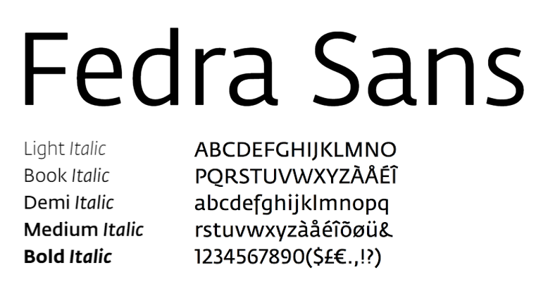
The official font type is Fedra Sans. This font type has a friendly and open appearance. It humanises the communicated message and adds simple, informal elegance.
Colors
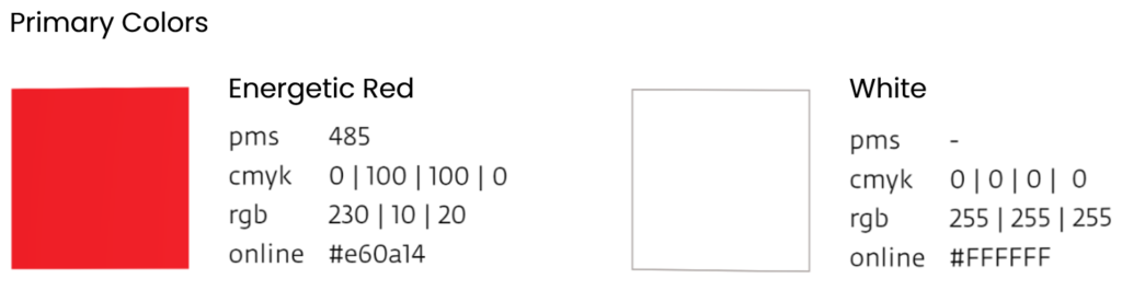
The primary colours of red and white are derived from the coat of arms. The color red symbolizes life; blood flowing through the veins.
- Province Zuid-Holland
- Design Agency: 2Seconds Creative Crew (René Bleuanus)
- Date of Introduction: 13th June 2022
Logo Land is a compilation of all the municipality logos of the Netherlands. In this book, you will find the origin and meaning of the logo itself and of the shapes, forms and colours that have been carefully designed in each municipality logo. A pioneering effort, the first-ever book in Dutch history to archive and explain all municipality logos in the Netherlands.
Order the book here: amitbiswas.nl/logo-land
0 Comments