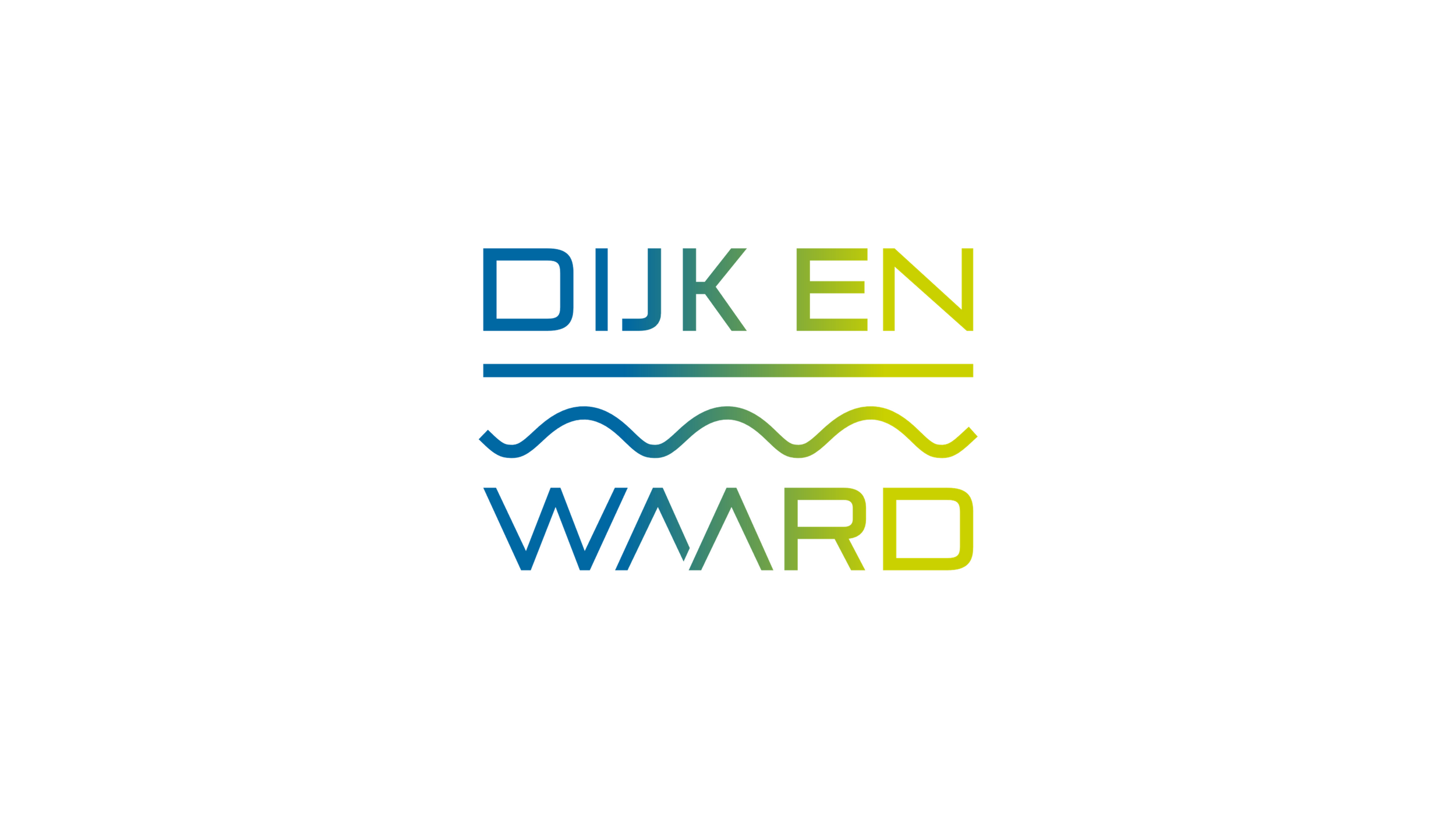
The logo showcases the geographical characteristics of the region.
On January 1, 2022: the municipalities of Heerhugowaard and Langedijk merged as one municipality of Dijk en Waard.
Both the former corporate identities of Langedijk and Heerhugowaard had the colours green and blue. In the logo of Dijk en Waard, these corresponding colours are visible. The blue and green colours merge into each other and represent land and water. The horizontal line stands for land and a wavey line for water. The region is characterized by its green polder landscape with surrounding water areas. In the Middle Ages, the inhabitants turned the swamp areas into fertile lands by digging ditches in between.
The font type of logo has been chosen by residents to ensure a strong, distinctive, innovative and recognizable appearance.
Video explanation of the logo :
Province: Noord-Holland
Designer: Raadhuis Creative Agency (www.raadhuis.com)
Year of Design: 2021
About Logo Land
Logo Land is a compilation of all the municipality logos of the Netherlands. In this book, you will find the origin and meaning of the logo itself and of the shapes, forms and colours that have been carefully designed in each municipality logo. Logo Land has featured in the leading newspapers and media channels such de Volkskrant, Reformatorisch Dagblad, Omroep Zeeland, RTV Drenthe, VNG Magazine, FRITS, Binnenland Bestuur, Nationale Ziekenomroep radio and RaRaRadio. The book ranked in the top 20 in the Boekhandel Van Piere top-selling book in CW 43.
0 Comments